
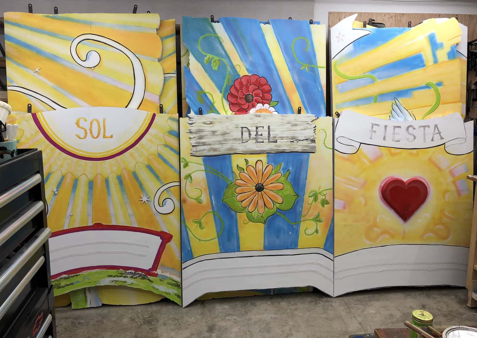
The initial brief was to create three twelve-foot panels to enliven a large space for an event occurring during Fiesta Del Sol. Each panel was to feature a phrase for the event including a motto, “Radiate Love.” Given as a point-of-inspiration-not-to be-taken-too-literally were the colorful garden boats of Xochimilco.
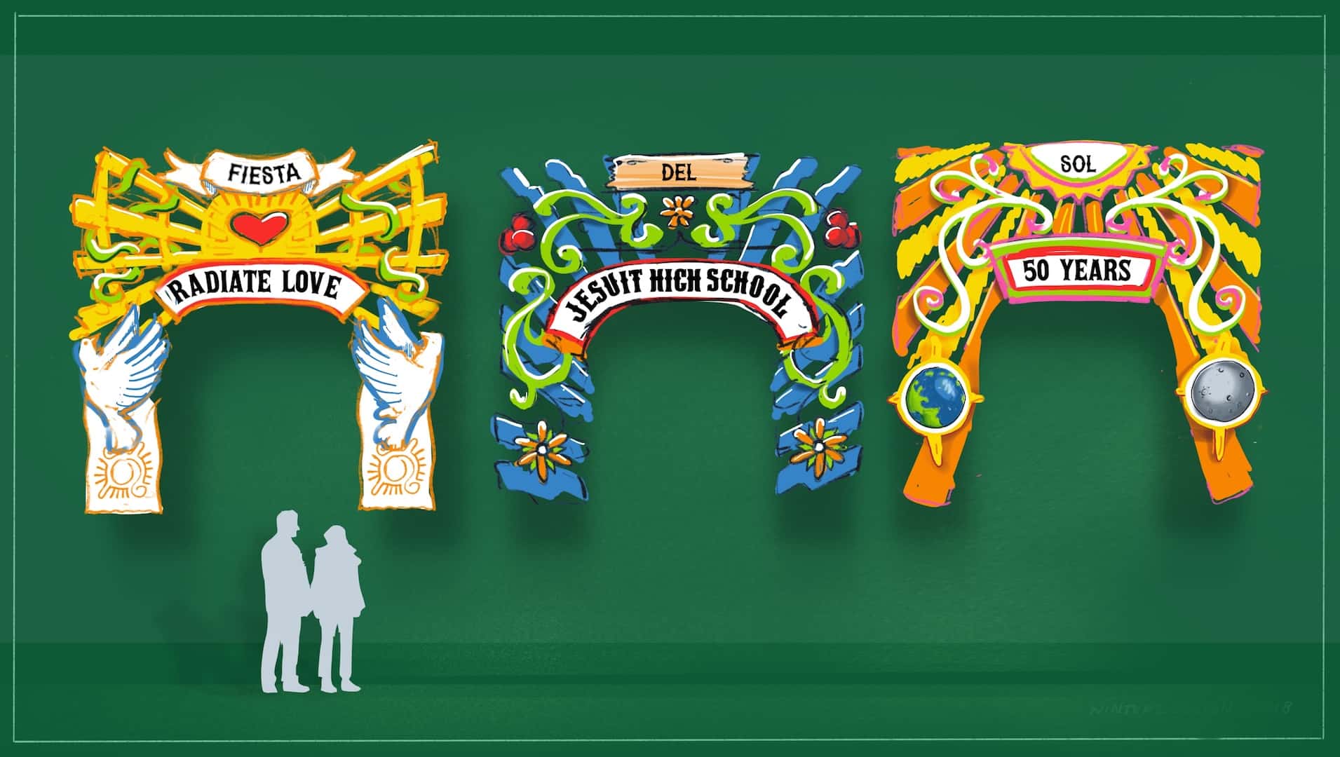
Early one morning after I submitted the initial concept, I was visited by the constraints fairy, that pernicious pixie who complicates concepts, restricts resources, and thieves time. The arches needed to presentable from both sides, I learned, safe to hang overhead, and be reusable. Then that imp of impediments revealed the budget to me; it was clear there would be no arches built as conceived.
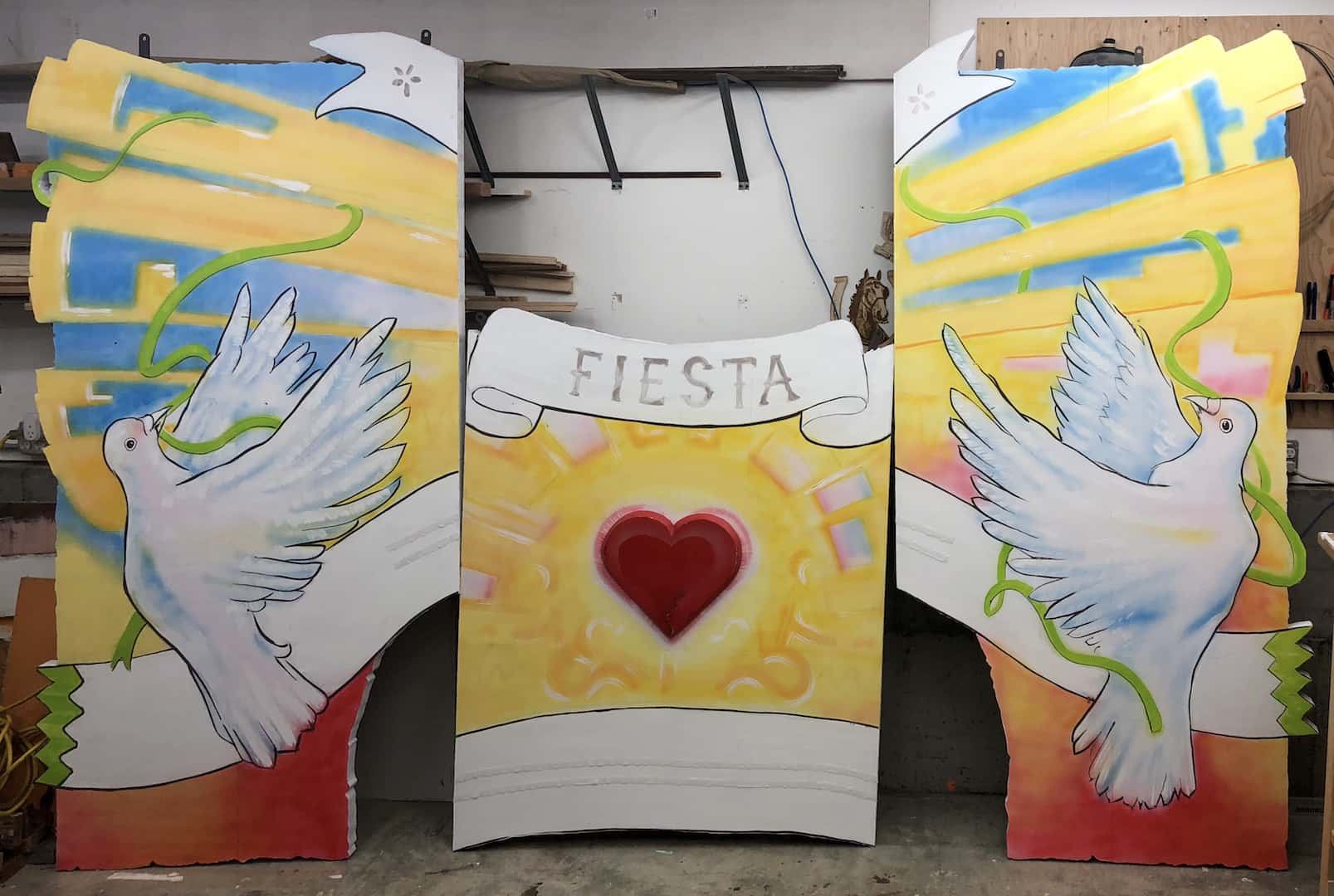
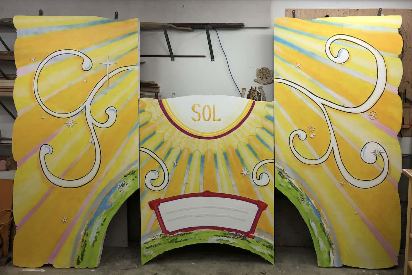
I later found an approach that would satisfy the constraints fairy and the needs of the event as well. Each arch would be composed of three panels of painted XPS foam insulation with a few 3D details on the surface. The reverse would covered in kraft paper. Hook-n-loop tape in the joints between the panels keeps them from swinging apart.

Lastly, the letters on each panel would be laser cut from cardboard, painted, and attached with velcro. This means the arches could be used for other events in the future.

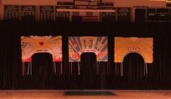
These finished pieces are too big to photograph properly in my workspace. The overview images below are composites, which is why the light on them looks a little uncanny.
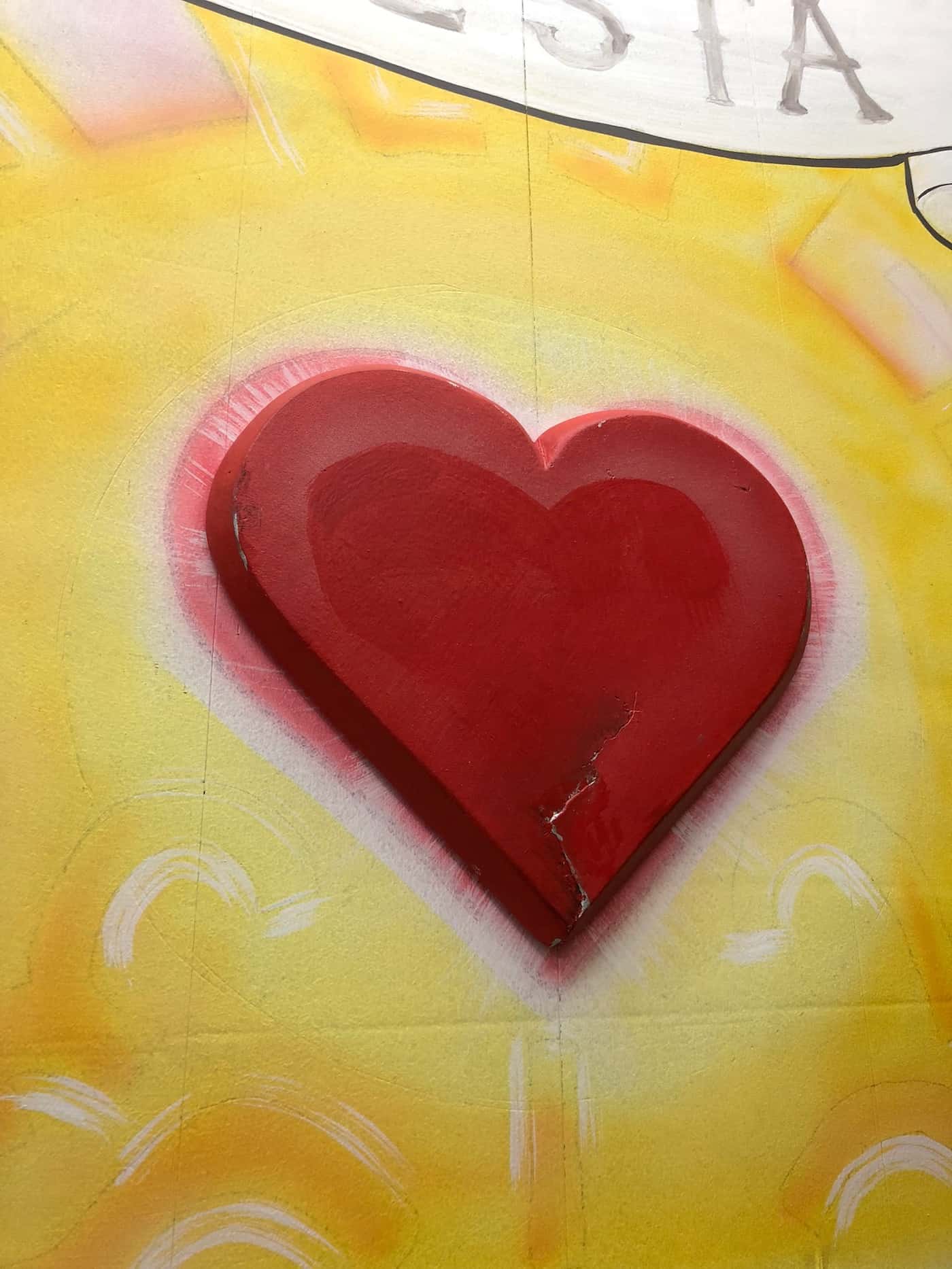
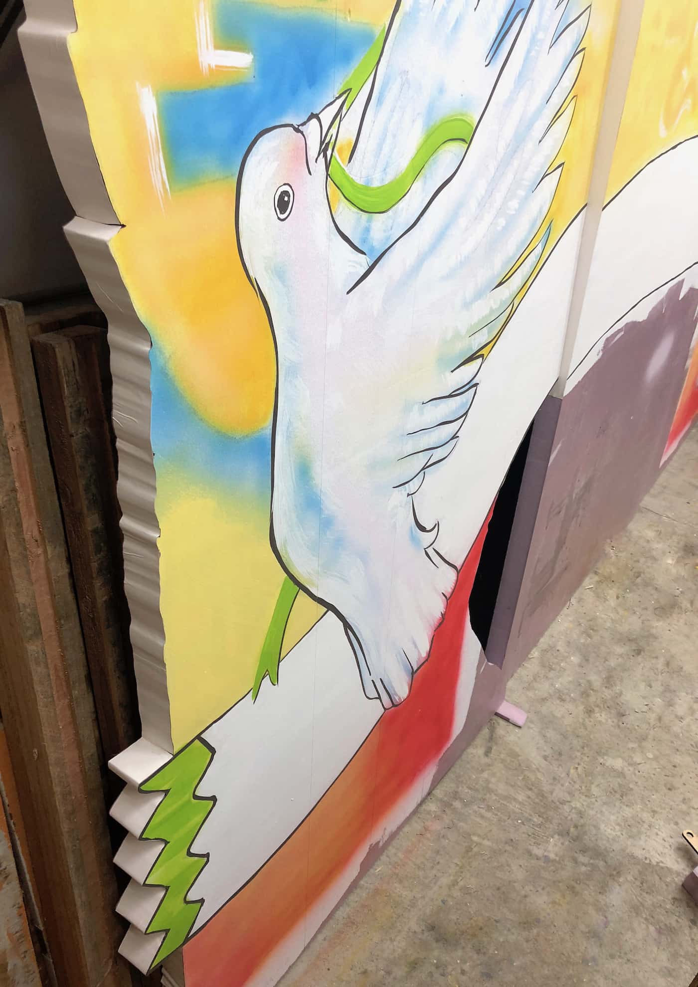
Radiate Love
The Greenhouse

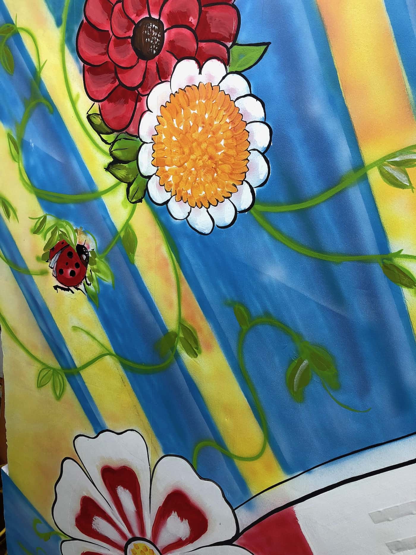
Everyone likes ladybugs. 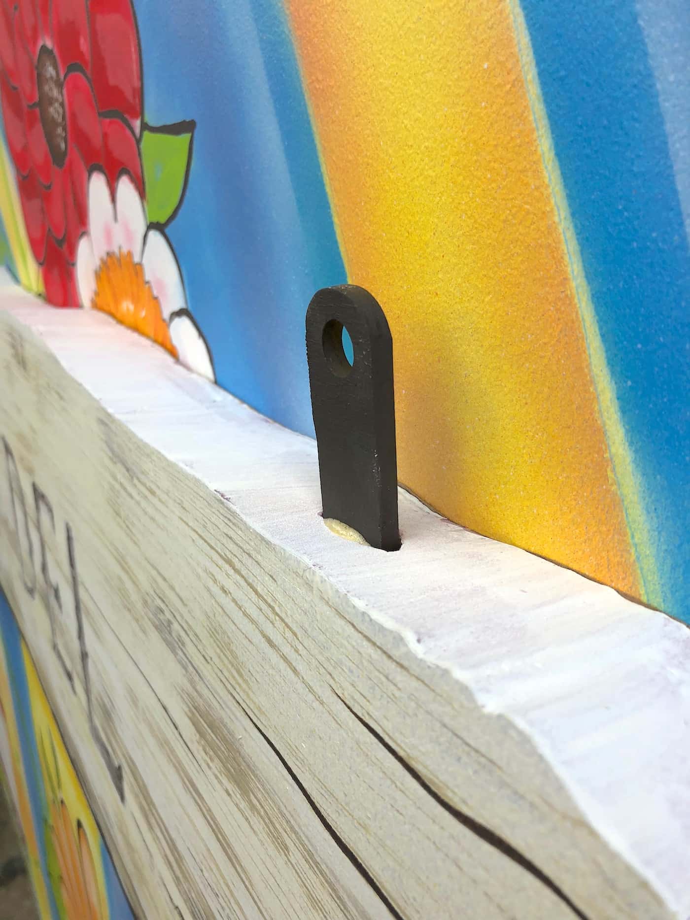
The panels hang from 8″ plywood spikes anchored with polyurethane glue. 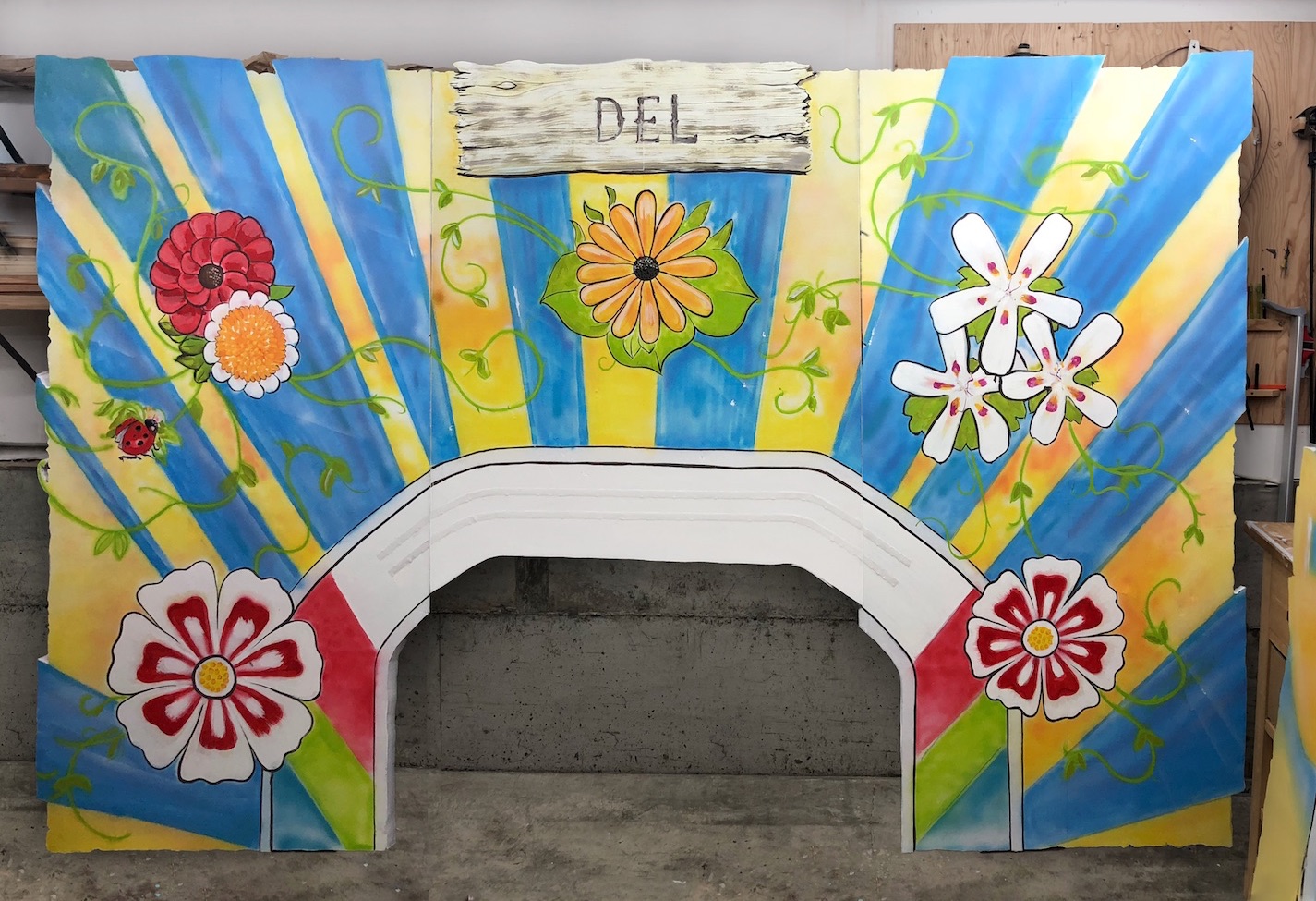
One Astronomical Unit

Airplane not to scale. 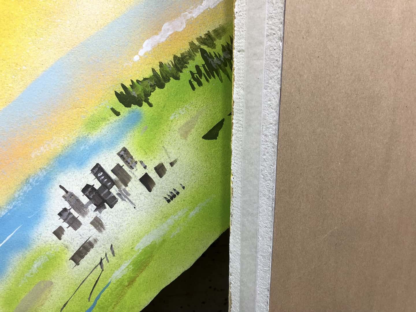
The blue haze of the atmosphere. 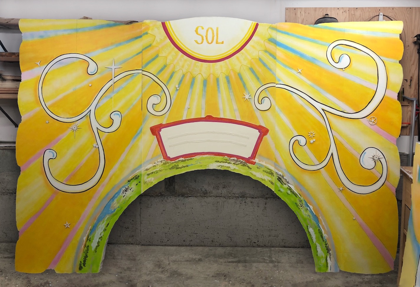

Once the panels were hung, the client was worried about the difficulty of reading the lettering from across the venue. Happily, the letters were held in place with hook-and-loop tape, so it was simple to change them out.
I found a typeface (AKA Posse) with larger apertures and less gingerbread but the same kind of character as the original (San Antonio Charros). The letters pictured above are about 3 ¾” high, and I calculated there was room to comfortably fit letters 4 ⅛” inches high.
A difference of only ⅜” may not sound like much, so I made a comparison image to give the client confidence in the relative readability of the proposed change. They were convinced and I cut a new set of letters.