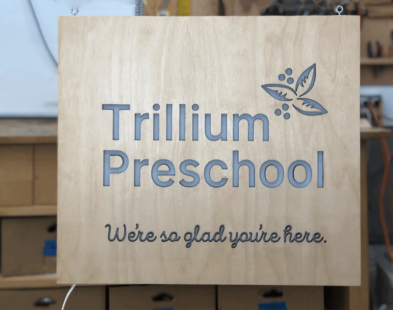
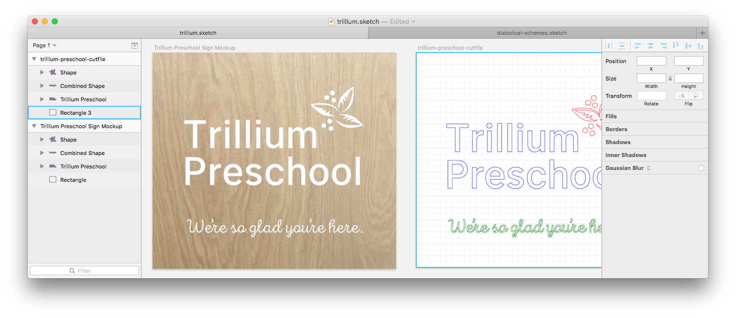
I had a pretty clear idea for this sign right off, so I skipped sketches and went straight to a higher-fidelity mockup. This showed the client’s name and logo in white letters against a sheet of natually-finished plywood. Planned size was 18″×20″.
We all agreed we liked the design and size so I moved on to production.
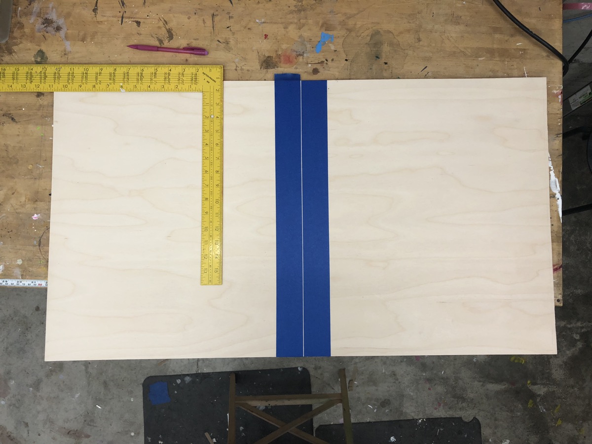
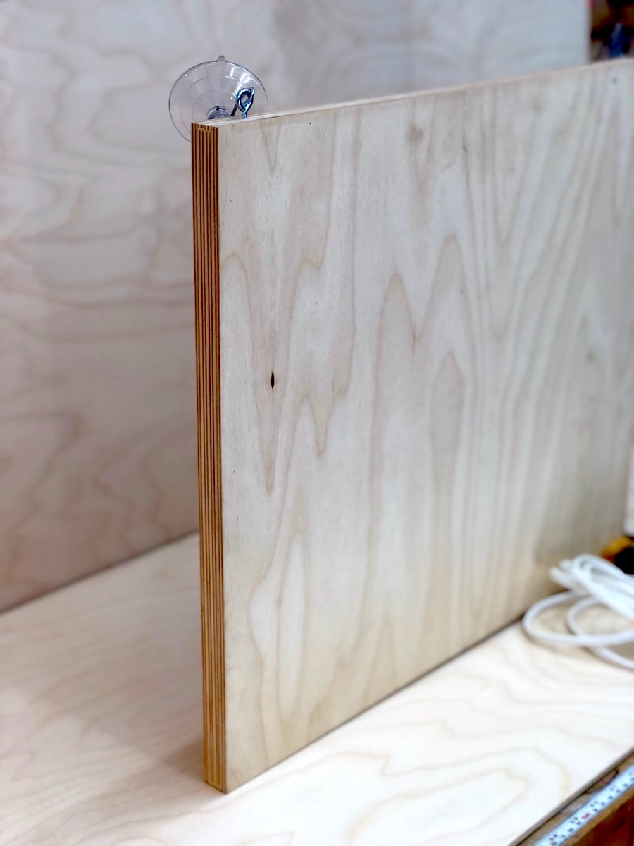
I had a piece of baltic birch barely big enough to be both the back and front. 
I taped off and lightly scored each side of the kerf to get a nice clean cut without setting up the tablesaw. 
Masked off to cut the letters in the face with the laser cutter. 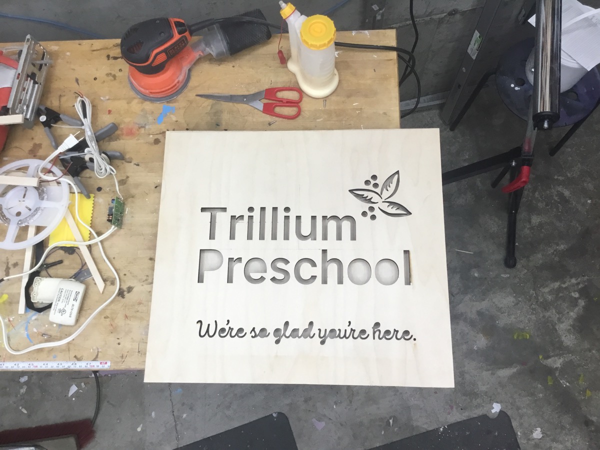
Having previously spent quite a bit of time cutting Helvetica by hand, I really appreciated having a laser cutter this time around. It left time to think more about the industrial design of the sign and less about mustering the hours of focus for extended fine work.
I carefully glued two thicknesses of the same material around the back side of the face. This creates creates space for lights inside and accounts for half the thickness of the finished sign.
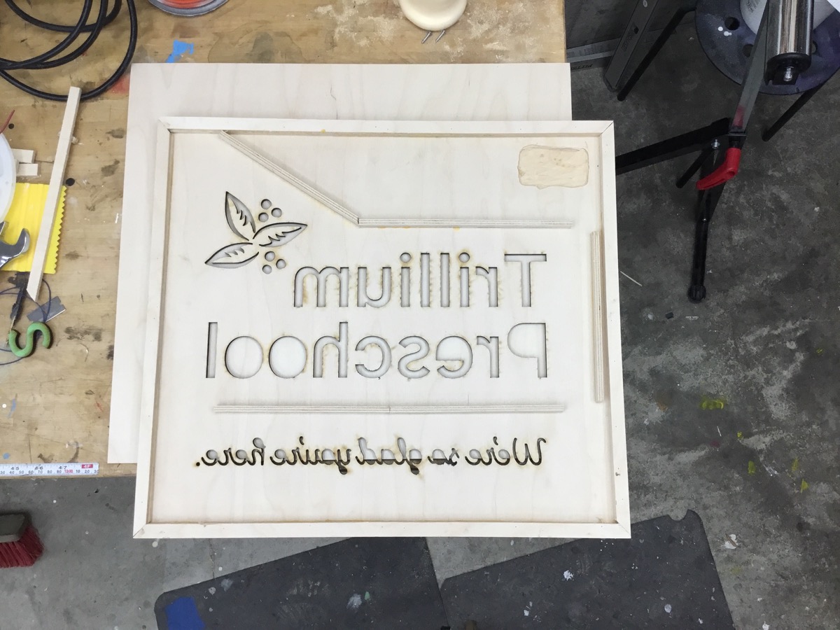
In the upper right you can see a relief I routed to in the inside of the face and the back to create a pocket for transformer. 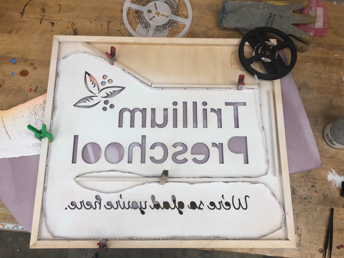
Mocking up an efficient path for LED strip. I ended up putting one more strip than shown.
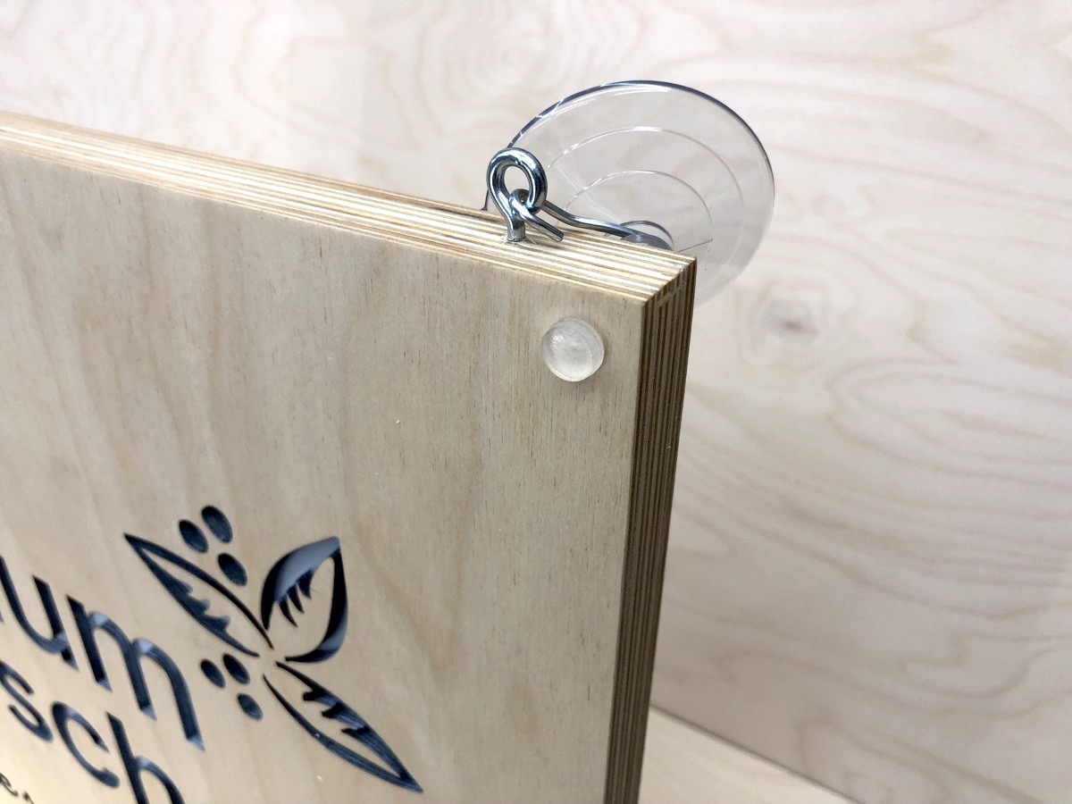
I backed the letter openings with frosted white plastic, then used the waste letter parts to position and glue in the counters (the eyes of the e’s and the middles of the o’s). A couple coats of polyurethane inside and out seal it off and minimize warpage. Lastly I finished it off with some simple hardware and an elaborate portfolio entry.