This sign features animated whorls of color controlled by custom code on an Arduino. The main body of the sign is CNC-cut and hand-finished expanded PVC. The clear lenses are were CNC-cut from clear acrylic and frosted by hand.
Here’s a peek at the sign’s innards. This intermediate plate was also CNC-cut to ensure perfect alignment between the side-firing LED strips and the acrylic lenses that mount into the sign face.
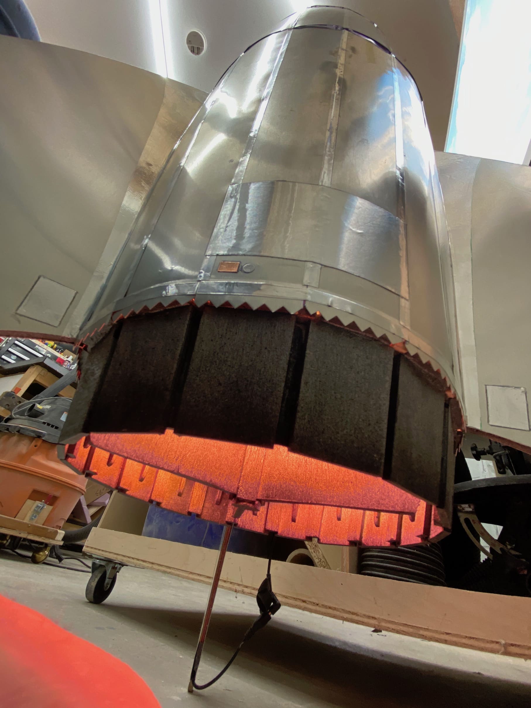
This rocket was inspired by Art Deco designs and the retro-futurism of 1950’s sci-fi. Sleek aluminum panels are glued in place over a base shape defined by lasercut bulkheads and narrow birch plywood spars.
Engine Lighting
The rocket uses a microcontroller to light three “engines,” each composed of a 7-LED disc surrounded a 16-LED ring. From a code perspective, this uses a different approach than the last time I created an LED flame effect. This prop depends on code written by Mark Kriegsman, and I’ve shared my version in pubic gist here.
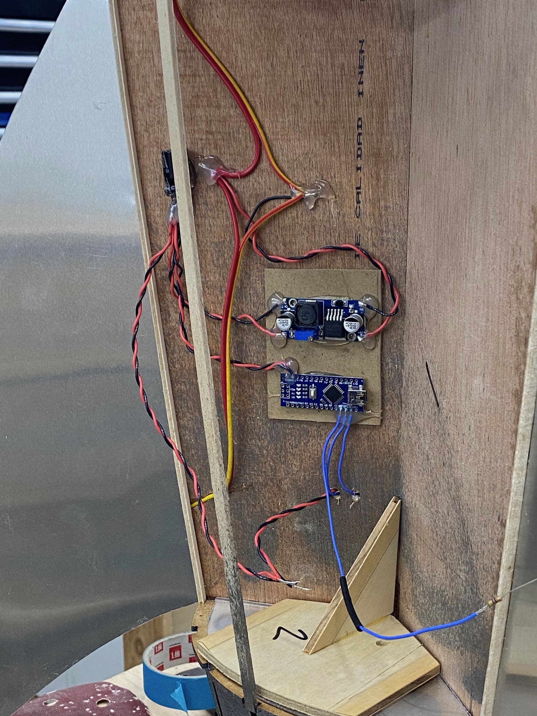
Engine light wiring: The upper circuit board is a buck converter that converts the main (12 volt) power to 5 volts, which to power the Arduino (lower circuit board) and the ring lights (bottom).
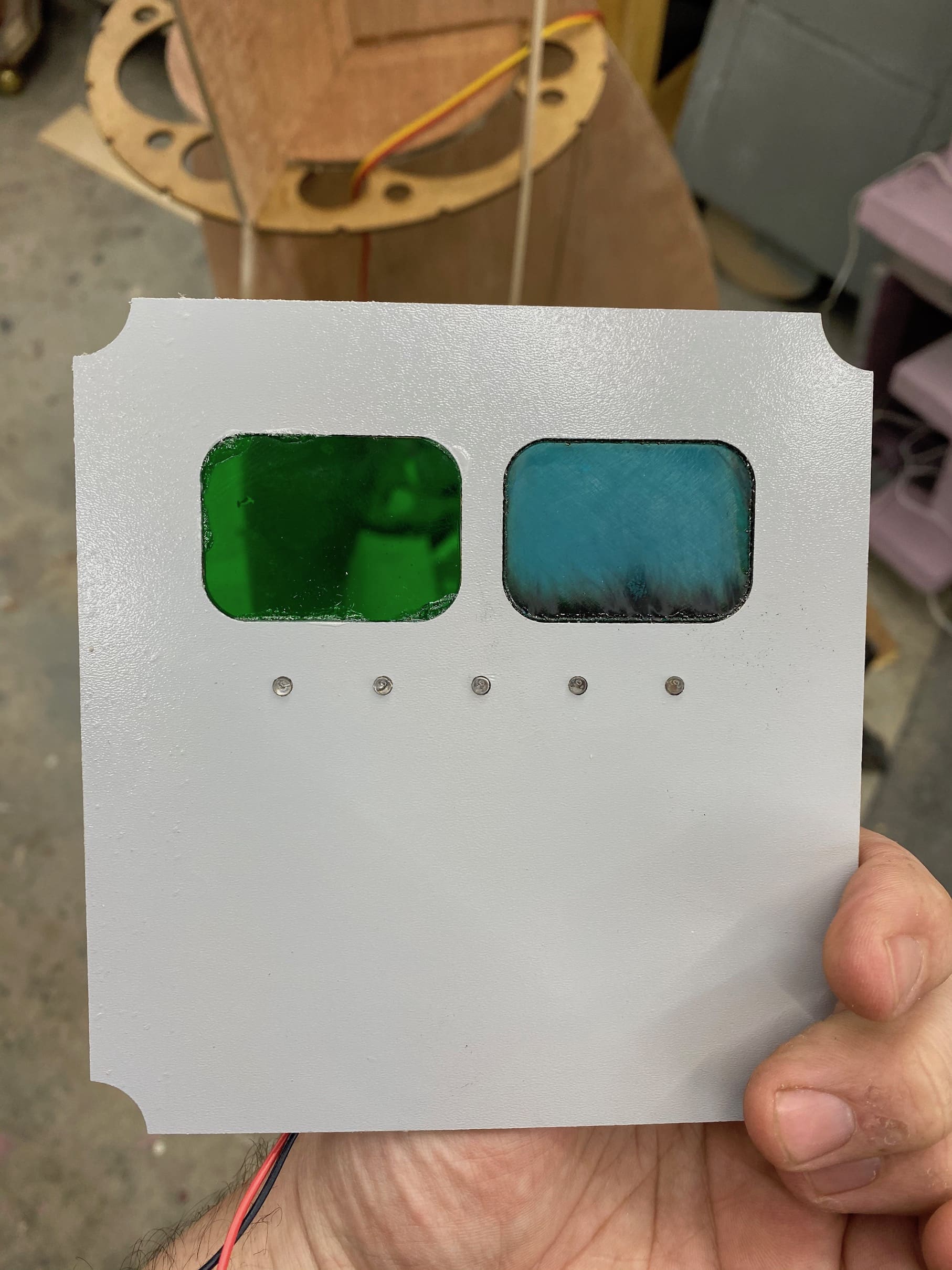
Porthole lighting
I thought simple illuminated portholes may be a little bland on a prop this size, so I made small panels to create some “screens” and subtle blinking lights you can see inside the rocket.
These are mounted deep enough to give a nice parallax effect through the softly frosted plastic portholes.
Along the bottom is a row of multicolored rotating-effect LEDS.
The screens are illuminated by the same LED tape that lights the cabin.
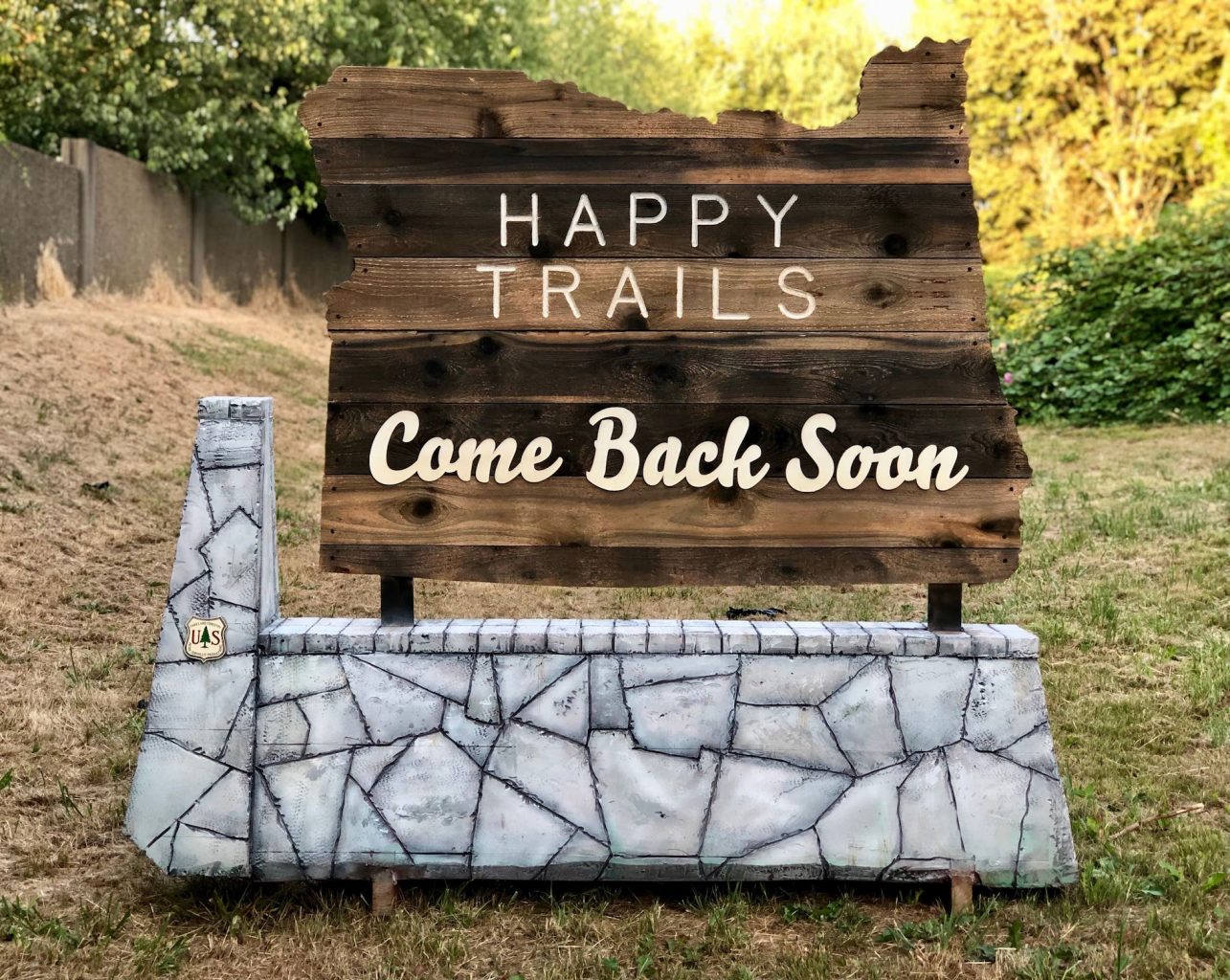
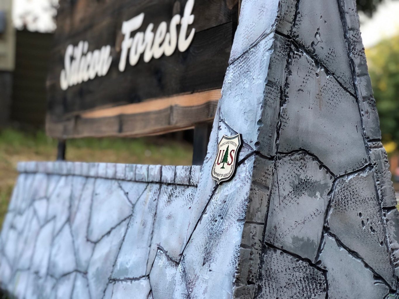
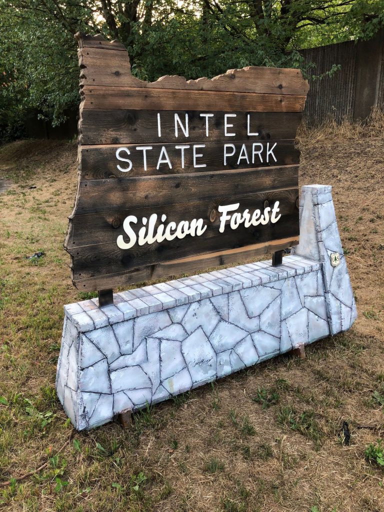
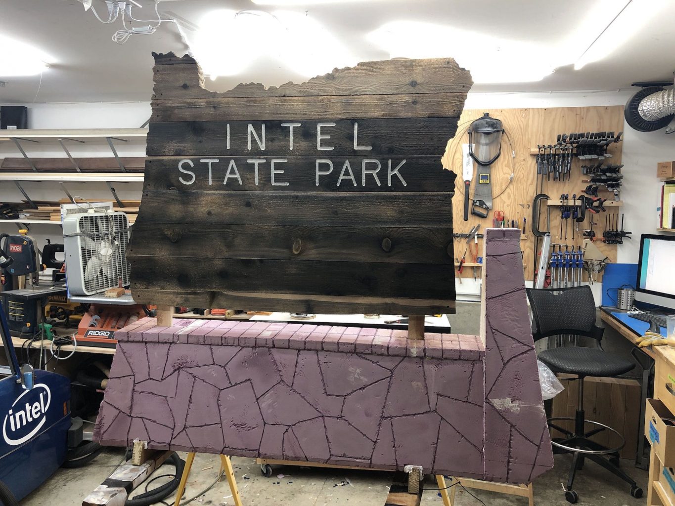
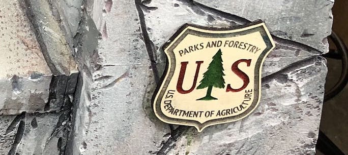
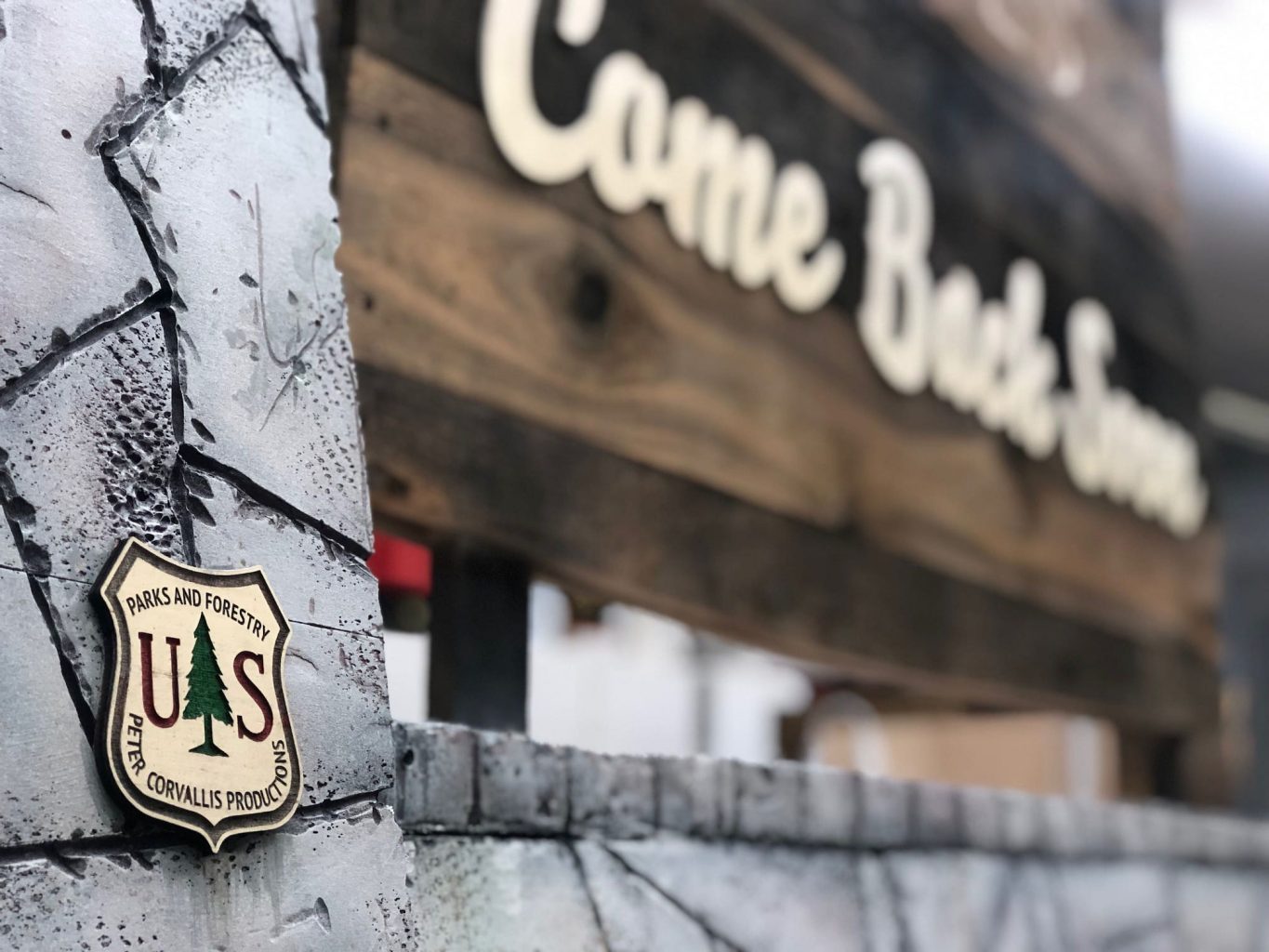
The sign features routed letters on iron acetate-stained cedar boards for the block titles and surface-mounted laser-cut script below. The base has a plywood frame clad with carved XPS foam stones that have been painted and weathered by hand. A couple of engraved and painted Forest Service-style badges bring some sharp detail and a pop of color to complete the piece.
Now, as it happens, I have made a sign very much like this one before. The client wanted a second sign to complement the first, so I set about creating a new sign that would look good next to the original and maybe take it up a notch.
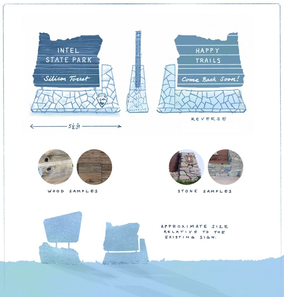
The new sign was to have swappable weathered planks, routed lettering, and a come-back-soon message on the back side.
The sketch I made to show my idea to the client (and for them to show to their client).
This page details my process for creating this sign, including research, rationale, construction methods, digital workflows, and a brief post-mortem.
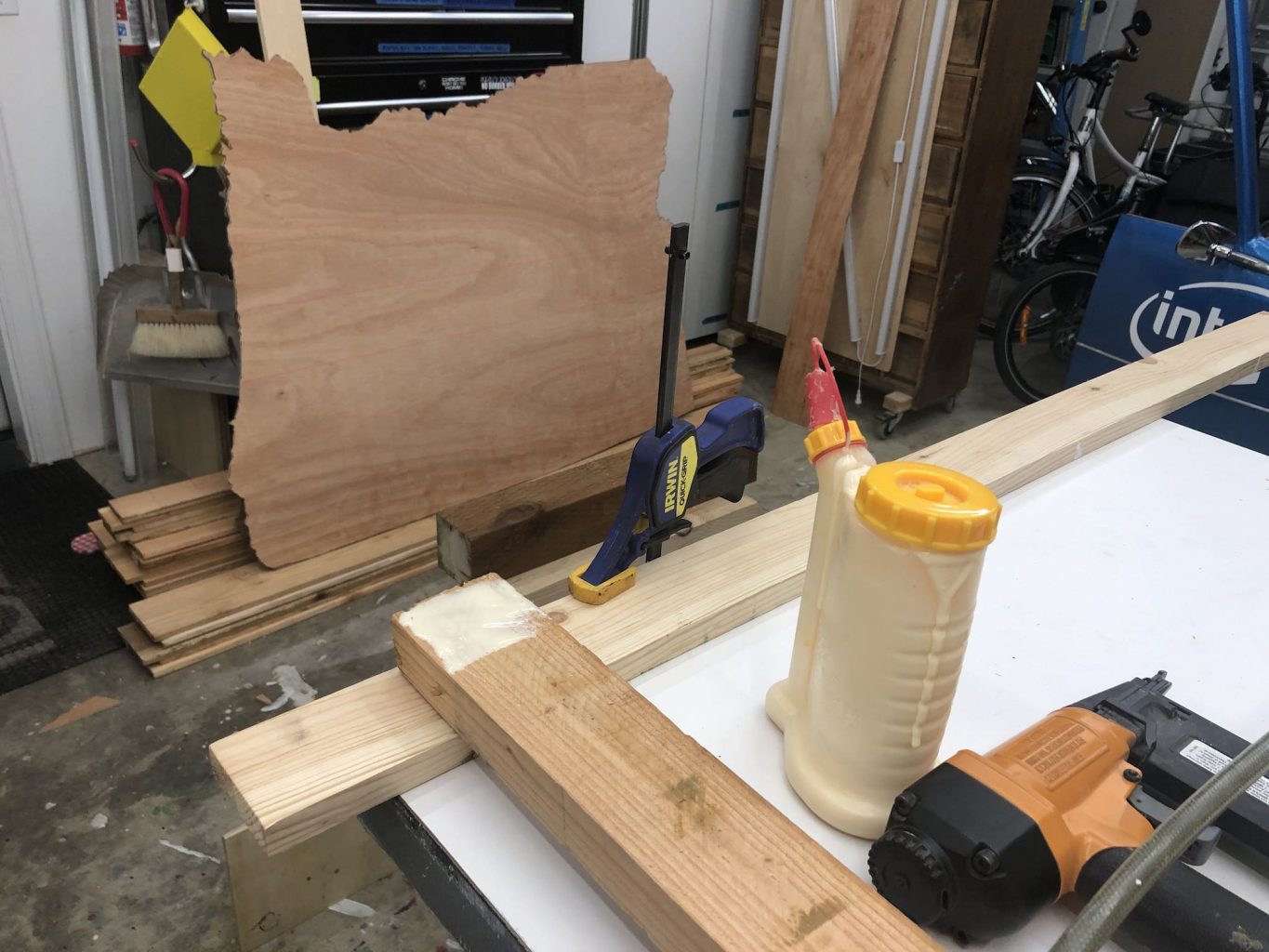
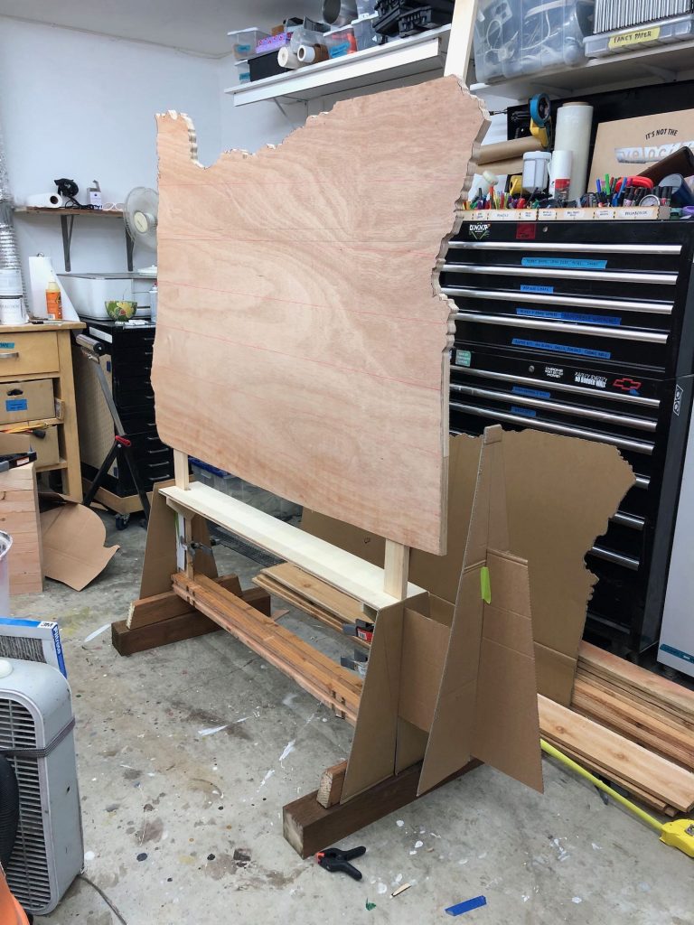
I started by tracing the shape of the state onto a large piece of cardboard. After cutting it out and walking around it a couple times, it was clear that the sign needed to be little larger than the shape I’d cut, so I traced and cut it again about 15% larger—this time in 1/4” plywood. This one seemed the right size, and I used it to gauge the proportions of the rest of the sign.
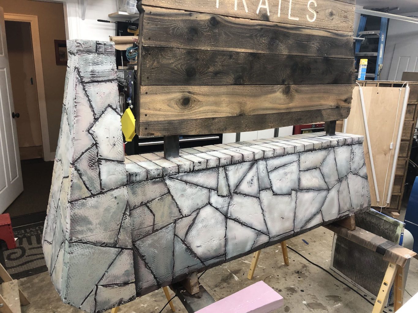
I made a simple frame from pine boards. Because the sign could be expected to be used outside, I attached the frame to a couple of short pressure-treated 2x4s as ground-contact runners.
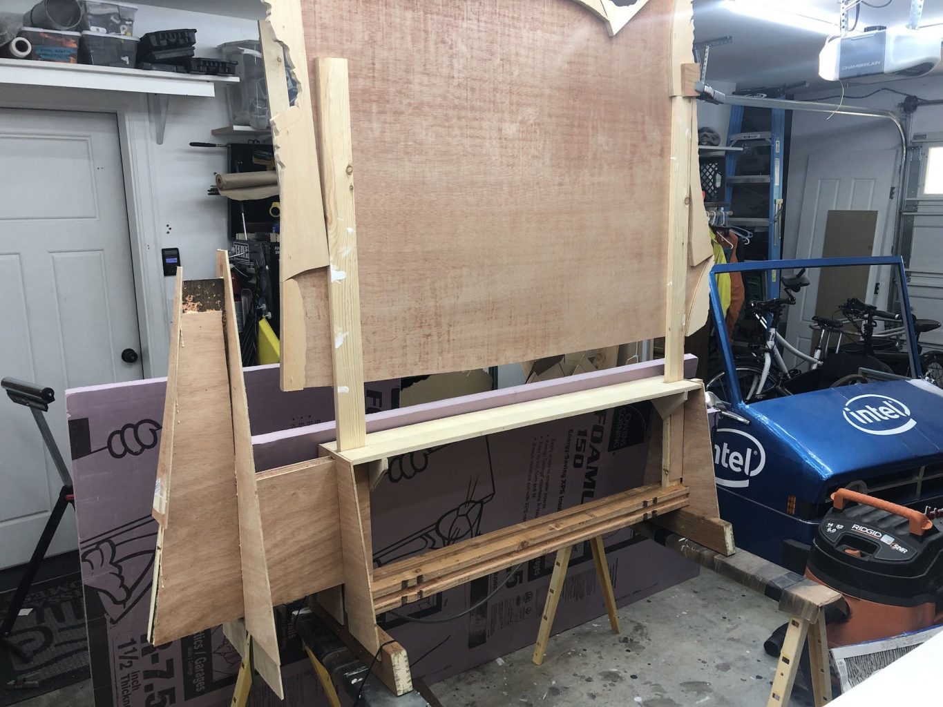
In the photos above you can see the cardboard templates I cut to fine-tune the shape for the base. I made bulkheads to support the foam panels at the right angle. These do double duty as strengthening braces for the main frame of the sign.
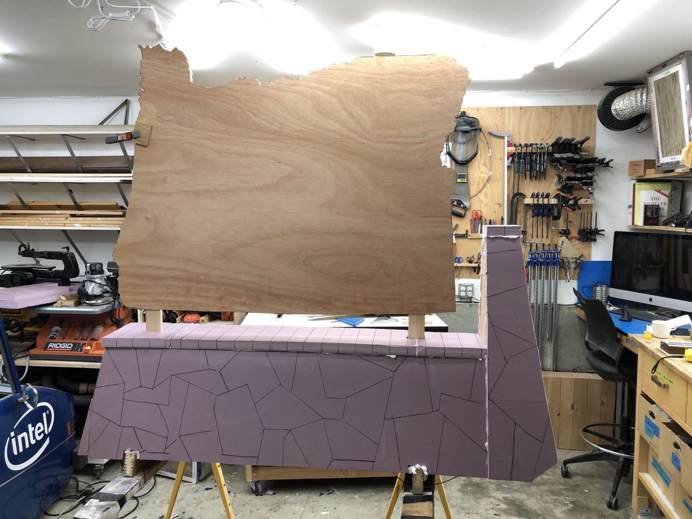
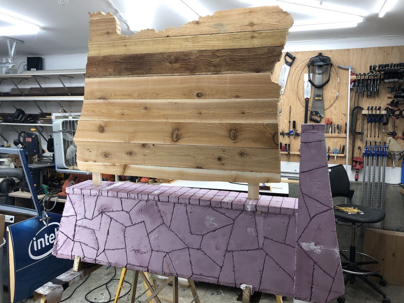
The cedar planks were cut to shape and screwed in place. I sprayed them with iron acetate (created by dissolving steel wool in common white vinegar) to turn them a dark color and impart an aged appearance.
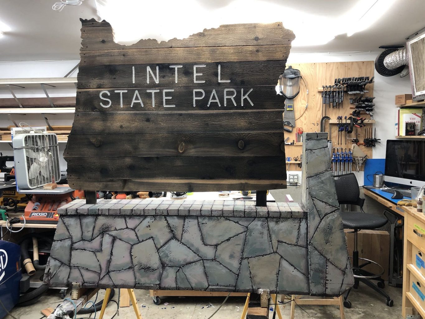
Carved Foam Stones
I cut panels of 1 1/2” pink foam insulation to form the outside surface of the base. These were cut to fit tidily and glued in place with gorilla glue and expanding spray foam.
I traced the stone pattern with a marker, and then gouged out the grooves with a soldering iron. A crunchy old wire brush and a rubber mallet helped texture the stones, then I sprayed a bit of brake cleaner here and there. Brake cleaner soaks through the tiny breaks in the surface left by the texturing process and eats away at the foam from within, giving a complex weathered stone appearance.
Paint and Weathering
I started by painting the base with a thin coat of a medium gray primer. Then I set about tracing the recesses I had carved with an airbrush and very dark cool gray.
Next I painted each stone one of several colors of light gray primer I tinted with cheap acrylic paint.
This is a (Bob) Rossian stage, where you tell yourself the story of the object. Water drains off here so there should be a streak, and thefasteners corrode and rust stains this rock, and so on. It seems self-indulgent but it’s a very effective way to achieve an authentic look.
It’s easy to get carried away, but that’s fine because the next step is spraying a thin white coat everywhere. This gives you a chance the modulate the colors and tie everything together.
Lettering
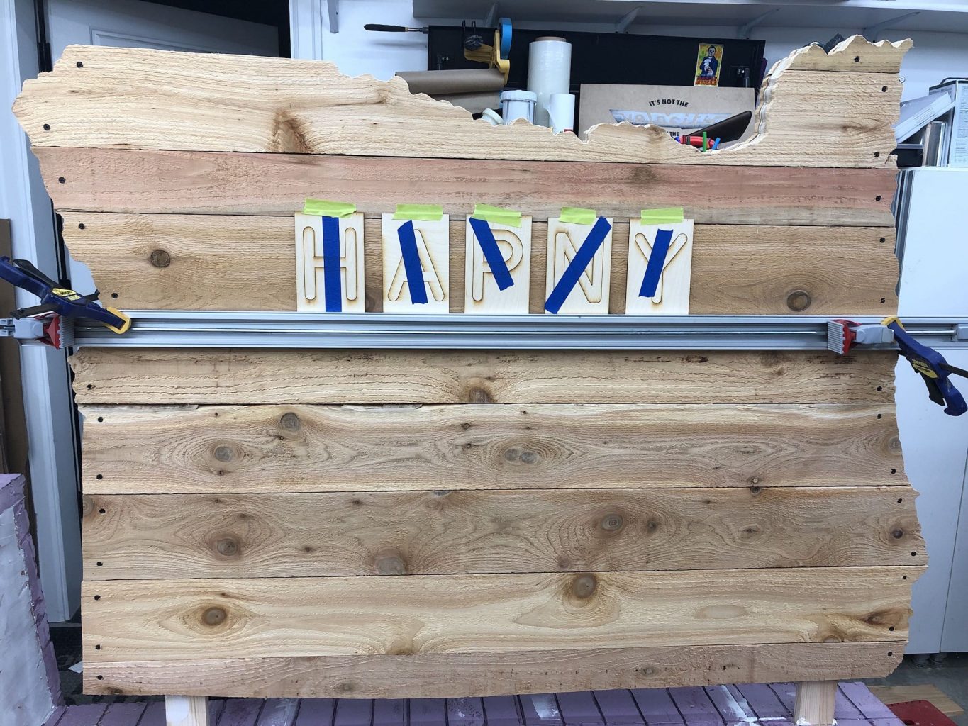
This project called for blending digital and practical lettering in a couple of interesting ways. The plan for the sign called for the lettered planks to be swappable to suit the needs of future events. I developed a way to create laser-cut templates to route block letters. I also designed a couple of new glyphs to make an existing font fit the look-and-feel of these classic forest service signs, and laser-cut the resulting shapes and affixed them to the surface of the sign.
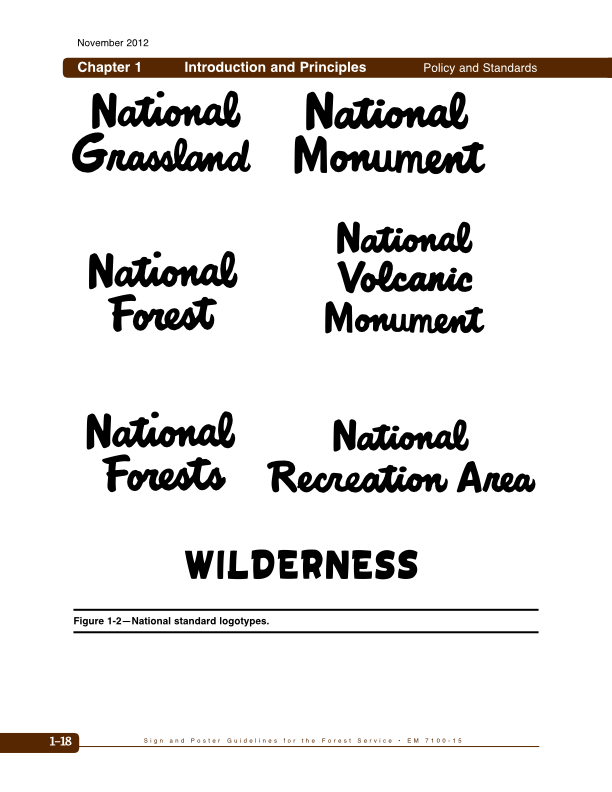
On the Lettering of National Park Signs
Of course, these signs predate digital typography. Therefore the text on them is not set in any particular named typeface.
The famous scripts that read National Forest or –Monument or –Grassland (at left) were originally hand-lettered and then simply duplicated onto other signs. Reference copies of these letterings are included in the US Forest Service’s Sign and Poster Guidelines.
Meanwhile, the block letters were created with handmade templates that are used to guide a carving tool called a router and were owned by the Department of Interior.
For many decades, these were the only “master” copies of these letterforms that existed. While there are commercially-available Letter Template Sets available today, they don’t capture the character of the original handcut templates.
Sample of National Park
When I made the Silicon Forest sign, there was no way to recreate those original block letterforms without doing it by hand. This time around drawing all the letters individually was not a appealing option. Happily, since then, Design Outside Studio put in the work to create the National Park Typeface, which was designed the mimic the Forest Service letters using rubbings of the original wilderness signs.
This amounted to a big head start for me, as these letters required only small changes to transform back into a pattern suitable for use with a router template collar.
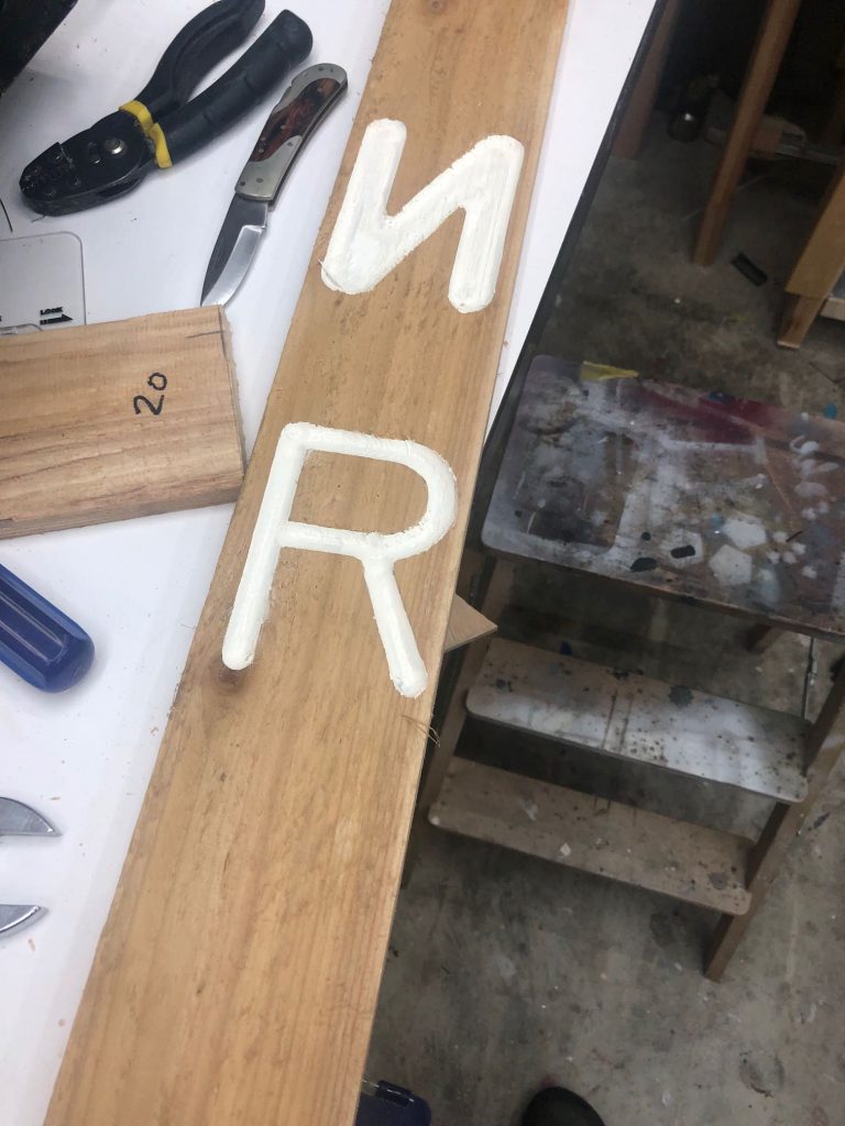
Routing Letters with Laser-cut Templates
To make the patterns for templates, I first converted the required letters to paths. The app I’ve been using to to create patterns for my laser cutter is Sketch.app. I used Sketch’s Layer > Path > Offset command to open the letter shapes by an amount a little large than the thickness of my router collar, though many apps have similar commands.
After some trial and error, I decided the medium weight of National Park paired with a 1/2” dome router bit and a 1/16″ offset gave the look I was going for.
I tried simply cutting templates based directly off the font glyphs in this way, but soon discovered that a few of the letterforms needed be tweaked to get a constant width to allow the guide bushing on the router to pass smoothly. One upstretched arm of the “Y” leg was slightly narrower than the other. “N” and “R” needed similar minor adjustments.
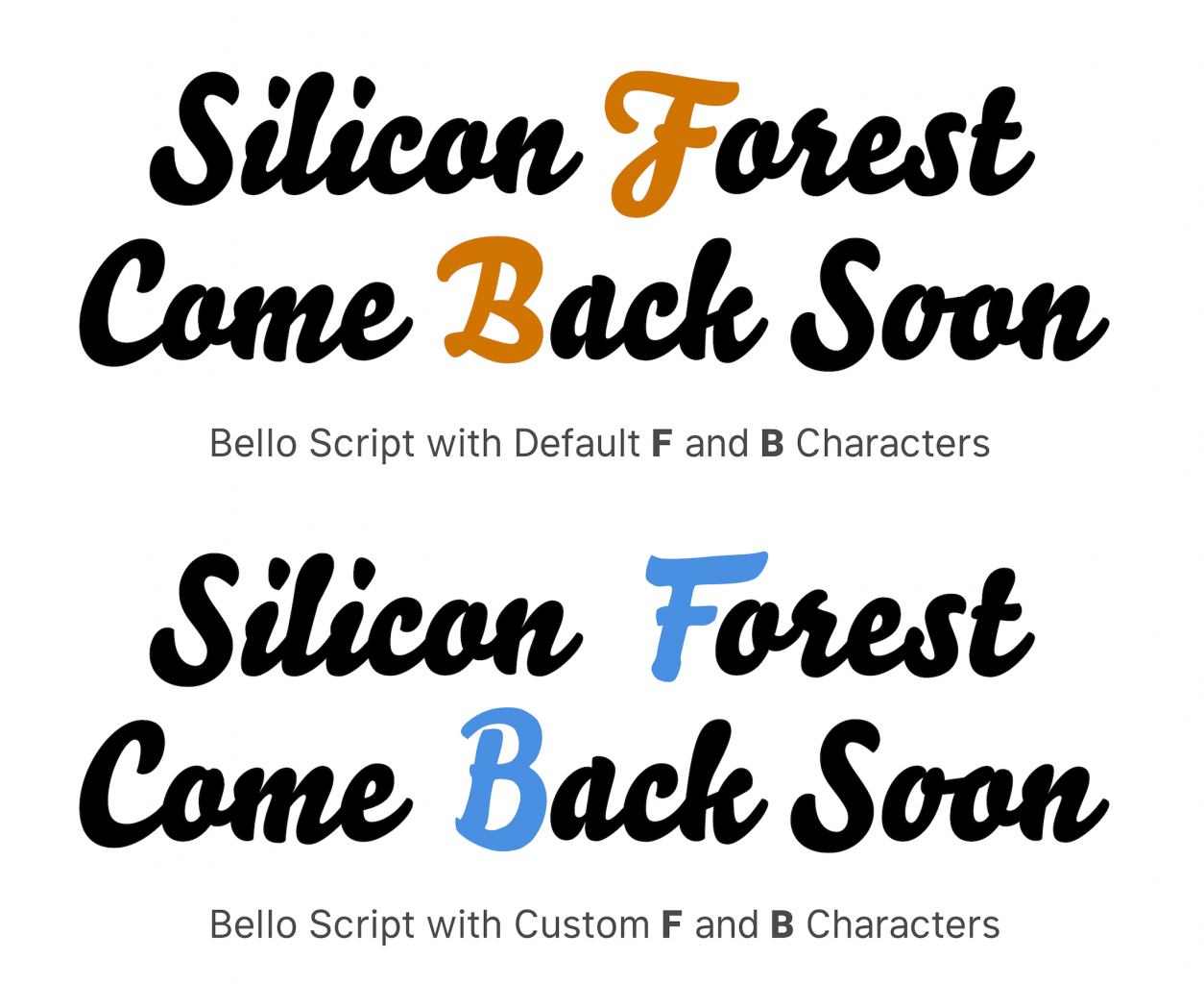
Alternate Capitals for Bella Script
Because I knew I may need to create new sign parts with different wording that matched the remaining letters (e.g., a “Summer Wedding” plank that matched the “Come Back Soon” on the reverse), I wanted to find a font that reminded me of the original hand-lettered wordforms. I settled on Bella Script, which is a nice face with lots of ligatures. It’s maybe a little too juicy compared to the originals, but has the right weight, slant, and general impression.
However, the distinctive shapes of the F and B letters were what I imagine Teddy Roosevelt might call “highfalutin.” They were just too different from the original scripts.
I drew the blue letters to make Bella Script into a serviceable replacement for the original Forest Service lettering.
I drew up alternate forms for those letters that (hopefully) would leave Teddy’s countenance pleasantly unwinced.
Creating the actual parts to get the script letters installed on the sign was straightforward. I converted the new letters I drew to SVG, made patterns for my lasercutter, cut and painted the pieces, and attached them with pin nails.
Badges
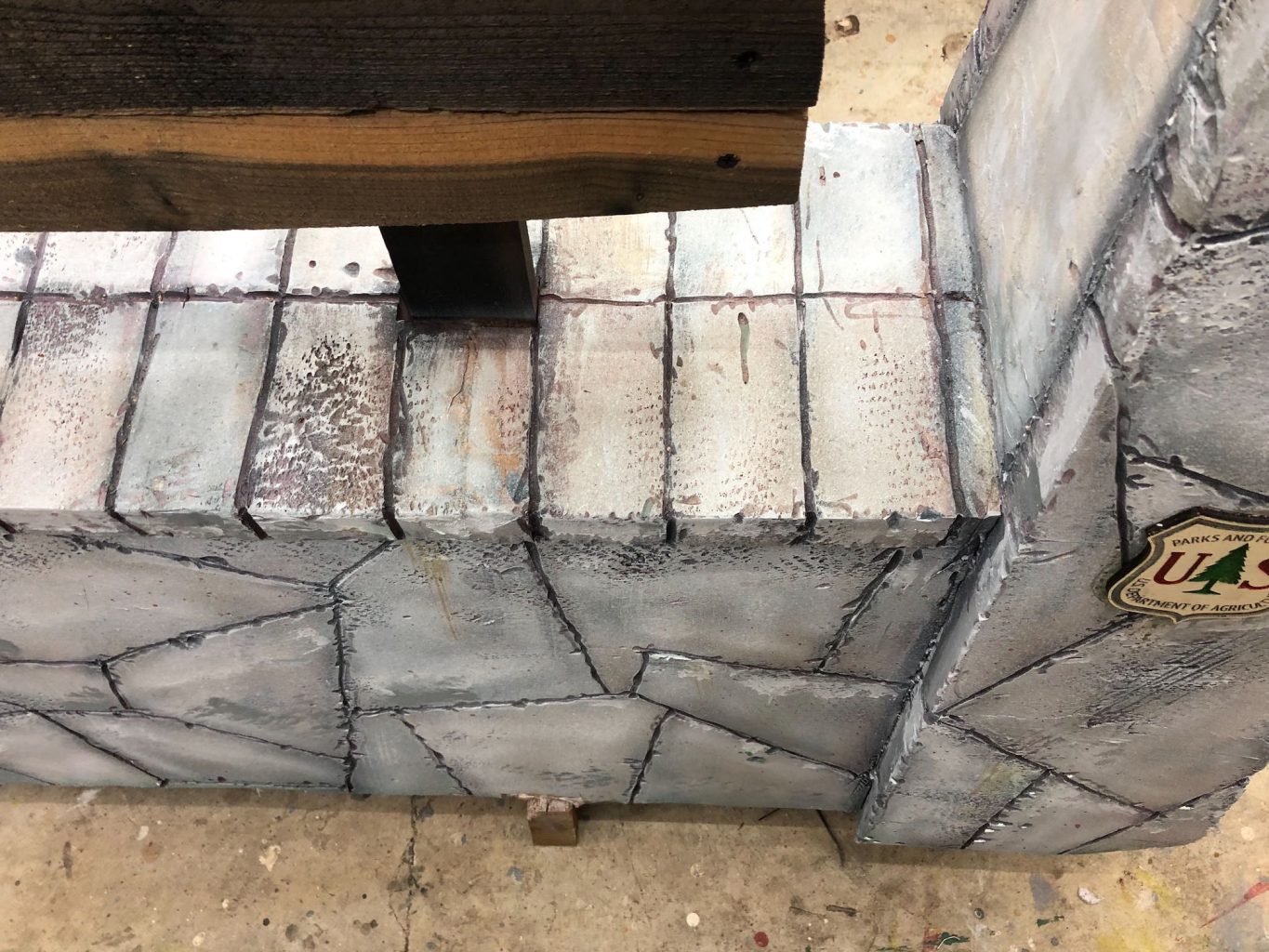
I created a vector version of the classic Forest Service badge and made a couple of changes.
I changed the text at the top from “Forest Service” to “Parks and Foresty” to be sure that’d would be no issues or confusion using the Forest Service’s official mark.
Also, I like to include little easter eggs for my clients when I can, so I included my client’s name in the badge on the reverse side of the sign. But I didn’t want the text-on-path in the easter egg version to clash with the tapered and finessed hand-lettered original, so I made a text-on-path version for the front, too.
On the right is the easter egg version I created for my client.
Each version was laser-cut and engraved, and then I painted in some color by hand.
Wrap-up and Lessons Learnt
If I had to do over again I’d give a little more attention to the inter-letter spacing on the routed titles on the front. The company that makes commercial set above solves this problem by having different sets of kerning pairs and multi-stage templates. I’m confident I could get results as good using my single-stage templates with a little more carefully initial layout. I’d also it more time into hiding the snap-here seam lines that run horizontally across the foam of the base, which are a more apparent than I’d like.
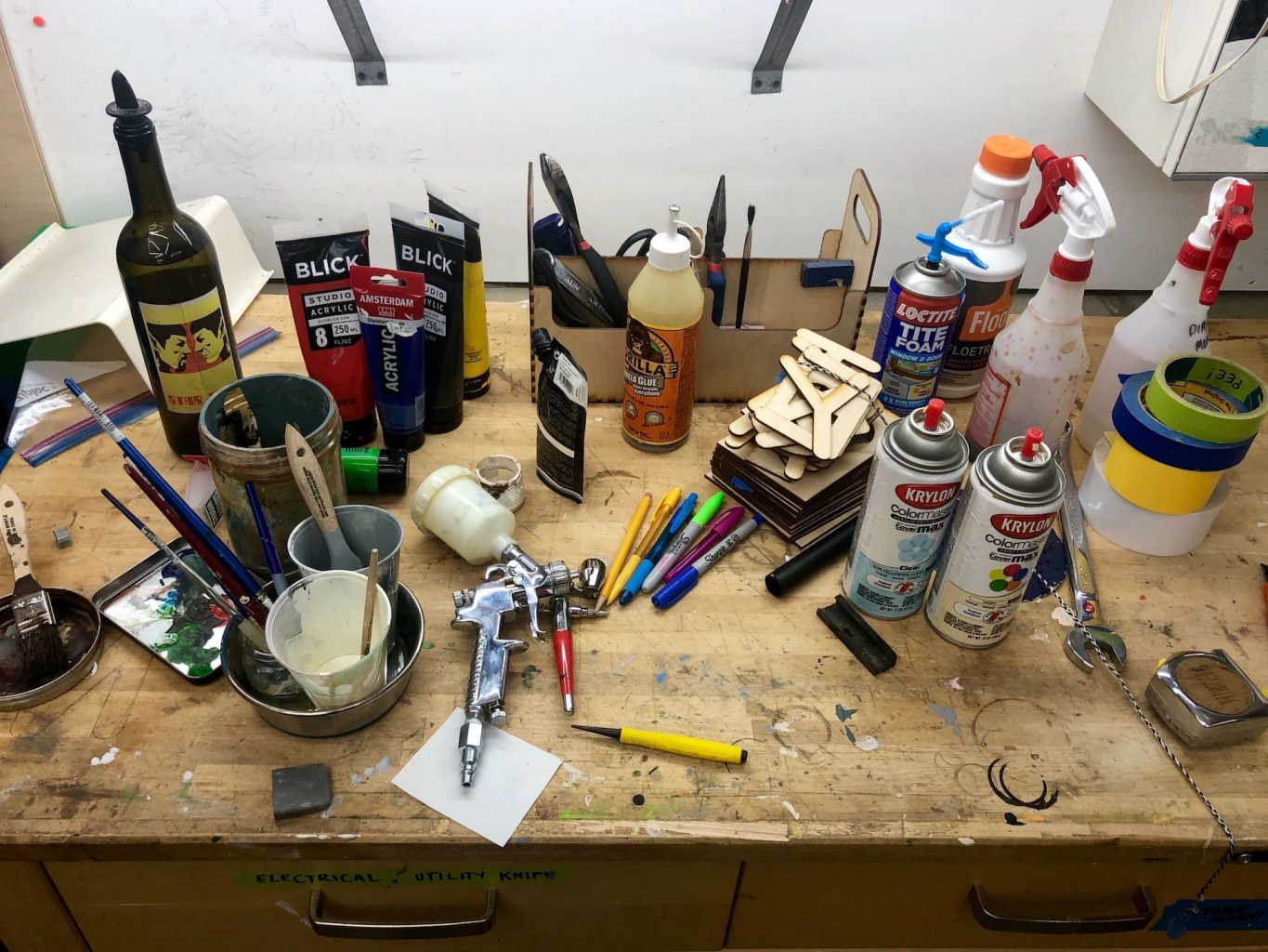
A snapshot of the collection of items found on my workbench when I finished painted the stone. Highlights left to right: a Star Trek wine bottle with a pourer filled with water I use to thin paint; cheap paint in primary colors; brushes, palettes, and paint cups; my cheapo HVLP spray gun and airbrush, polyurethane glue I use for foam panels, laser cut templates, spay paint for the badges, a spray bottle with vinegar and steel wool solution, a wrench for the router collet and some tapes of the masking variety.
That said, it was all-in-all it was a really fun project. It’s damn rare to get an opportunity to reprise an earlier piece. I’m happy with the results and I’m glad I got to do it again.
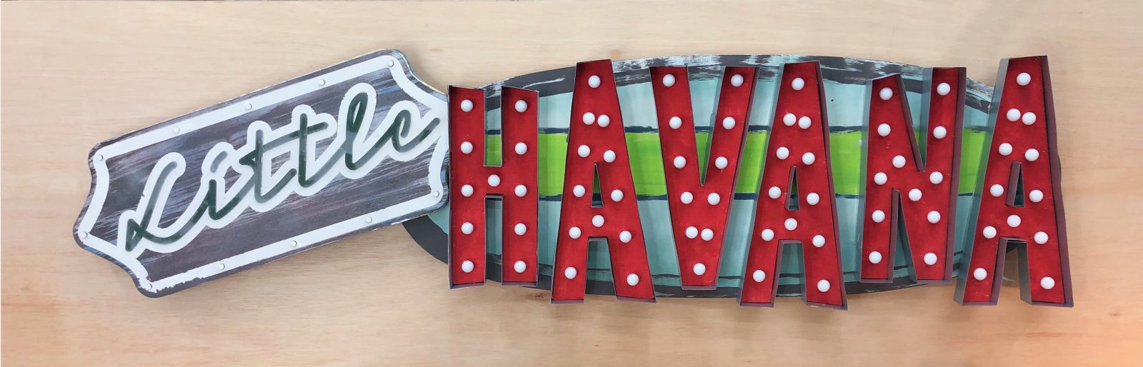
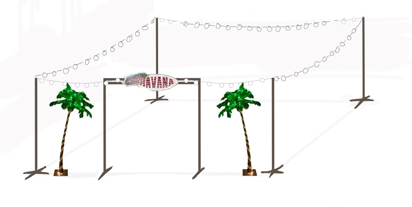
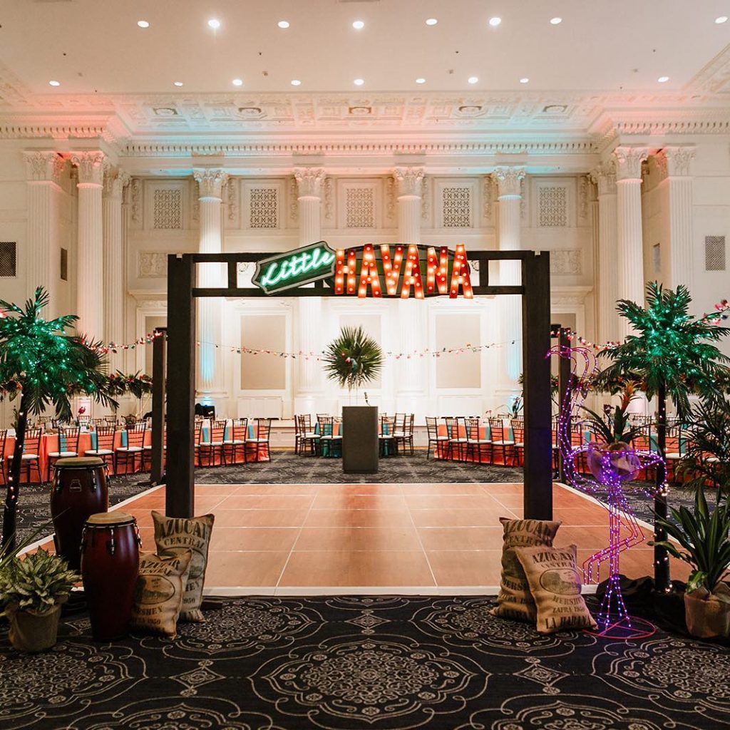
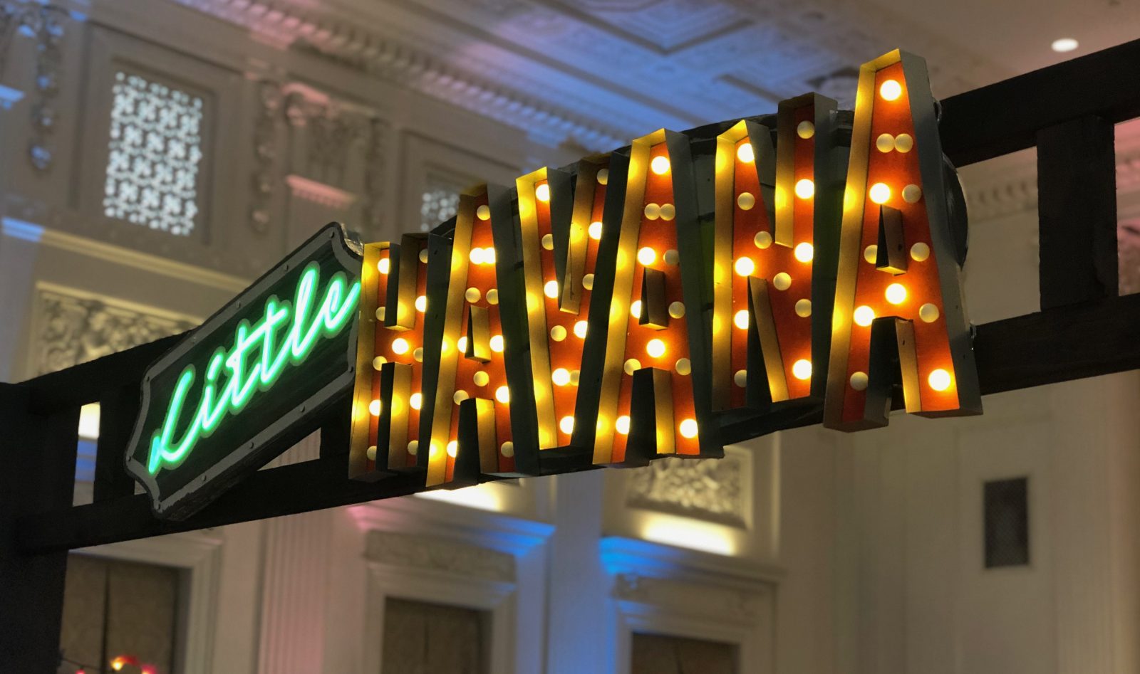
This two-in-one sign pairs LED-powered fake neon script with big galvanized-metal-wrapped marquee letters. Each half is built on a common base plate, making the sign strong and easy to hang and handle.
Lights Off
Lights On
The completed sign is 5½ feet in length, 18 inches high, and weighs less than twenty pounds.
Design Process
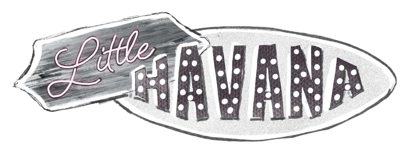
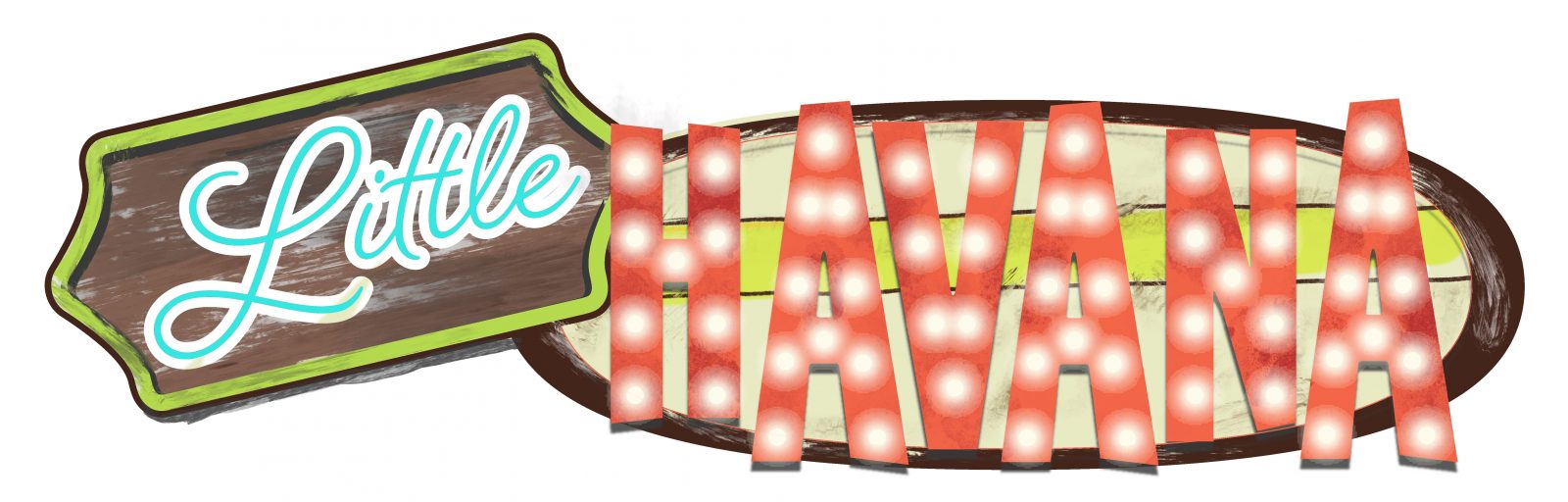
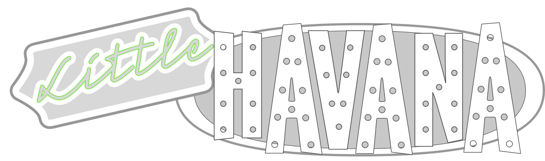
Below are my initial sketch, a high-fidelity mock-up, and a representation of the finished design I used as a cutting pattern.
This initial sketch was done to give an early approximation of what I had in mind to get feedback as early as possible.
In the color mock-up, you can see I broke the HAVANA letters out of the base shape to give the sign a more interesting silhouette.
The client wanted to see a different typeface for the word “Little,” so in the final pattern for the sign you can see that change as well.
Plans also called for a structure to hang the sign over the entrance to a dance floor, and some columns from which to hang lights around the perimeter.
Layout and Fabrication
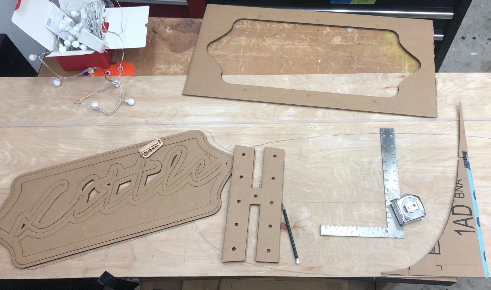
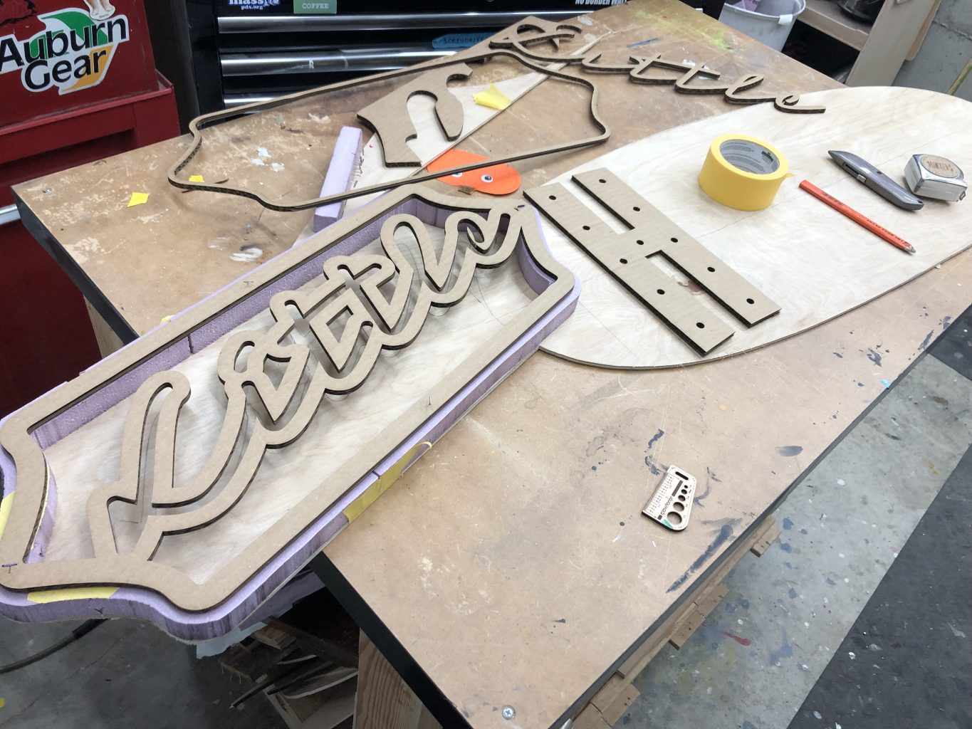
I planned to lasercut the Little as well as the HAVANA letters, but the main back panel was too large to reasonably produce with my lasercutter. Instead I made cardboard mockups of the parts I could cut and used them to lay out the rest of the sign.
At the upper left you can see the off-the-shelf blinky lights I used for the marquee letters. I checked the width of the bulbs against the holes in my cardboard mock-up H to ensure they’d fit snugly in the final parts.
This process revealed that marquee letters were too close together in the initial drawing. Especially when boxed with metal strap, I worried they would run together and become difficult to read.
The fix was easy: I elongated the oval base shape and made room to space the letters out a bit more.
The faux neon part is built like a lightbox. I used a foam cutter to make the spacer that separates the Little face plate from the back. I cut a green acrylic lens with a frosted clear face, and mounted eight rows of double-density LED tape inside.
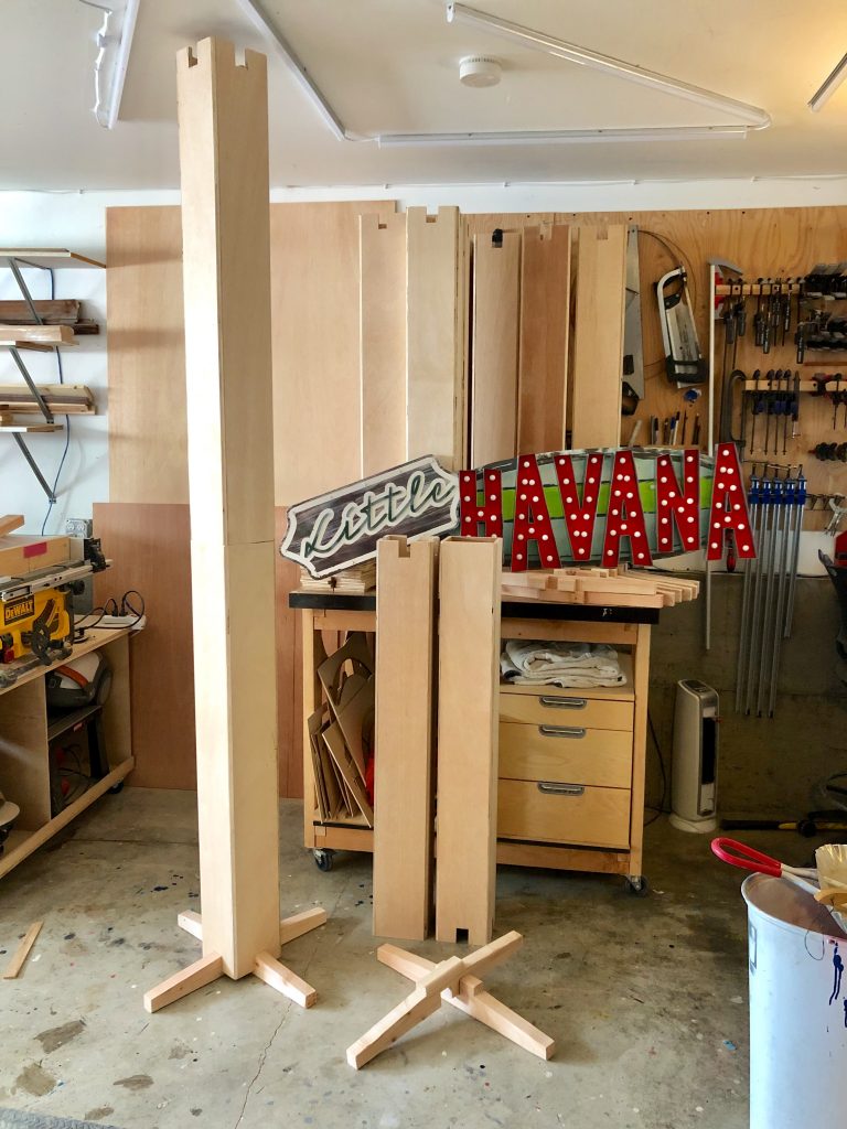
The columns are simple two-piece plywood boxes with identical notches at the top (for hanging string lights) and the bottom (for the feet).
Not shown are internal sleeves that connect the top and bottom of each column.
Also not shown are sand-filled weights I made that fit inside the bases, but leave enough room for electrical wires to pass inside the columns instead of taped to the sides.
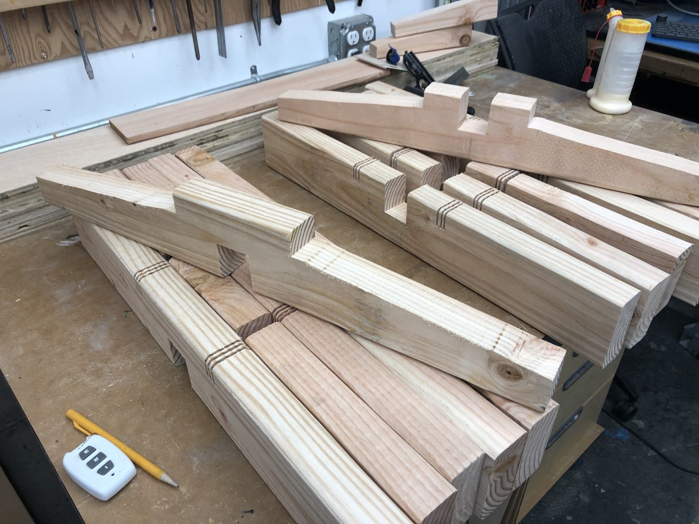
The base of each column is supported by crossed legs. I made these in two versions, an “over” and “under.” Here you can see an example of each. I cut the slopes with a bandsaw. Beneath them are the blanks I made for each version with a table saw sled.