Project Type: Software, Websites, and Code

I’ve written and released software for iOS and OS X. I run a small network of websites, and I love learning new programming languages.

  • Meeting Series for WooCommerce

    Meeting Series for WooCommerce

    I made this plugin because I was dissatisfied with the landscape of event plugins capable of selling event registrations. Most event plugins make selling registrations a premium feature, but their event management features and interfaces (calendars, event check-in, venue maps, algorithmic schedules) were overkill for my needs.

    WooCommerce could almost do the job alone, but its labels and naming conventions make the experience confusing for client and end-user alike—I don’t want the user to “Add to Cart”, I want her to “Register Now.”  I don’t want the organizer to have to look up a list of “Orders” to learn who is attending, it’s better for them—and me—if the labels, emails, and menu items say “Registrations.”

    Meeting Series for WooCommerce is the solution. The plugin makes use of standard hooks, actions, and filters. It includes minimal styles and markup. It represents a complete, free, and open source solution for the minimal case of selling events with WooCommerce on WordPress. It is lightweight, flexible, and should work with any theme, product type, or payment gateway.

    Source on BitBucket | Download Now | Donate 

     Features

    Meeting Series for WooCommerce is opinionated. It assumes the site will be used only for selling registrations to meeting series.

    Though it is broad in scope, changes made by the plugin fall into five groups:

    • Rename “Product” and “Order” to “Meeting Series” and “Registration.”
    • Add “Meeting Dates” and “Meeting Venues” in the admin and front-end.
    • Add fields in the editor to choose a “Meeting Subject”; another static page on your site that describes the meeting series. (This makes it easy to host multiple meetings that cover the same shared subject matter.) This description is inserted at the top of the page on the front-end. 
    • Changes buttons, labels, and text on the front-end of the site to provide a consistent user experience.
    • Provides print styles for printing the registration confirmation page as an invoice. 

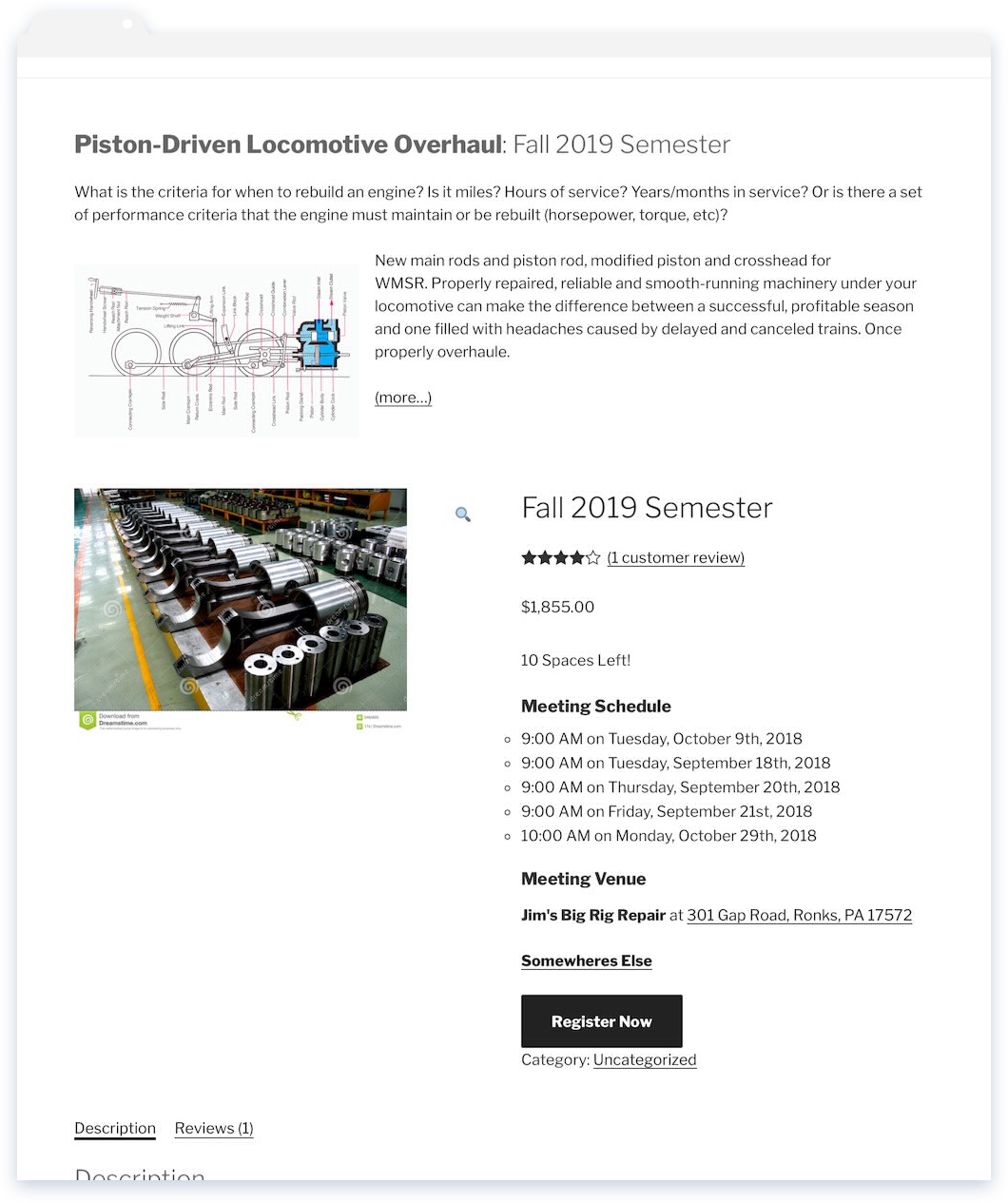
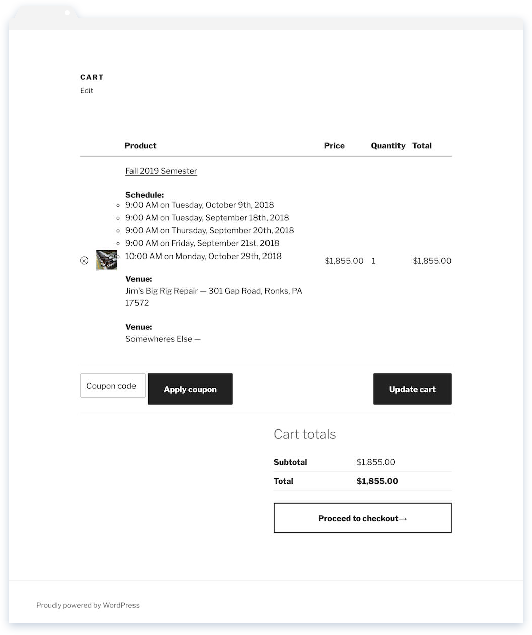
    Front-End Screenshots

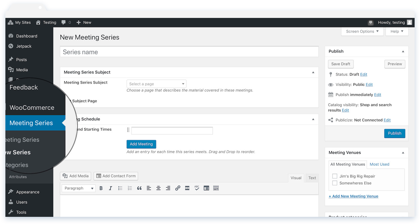
    Dashboard Screenshot


    Usage

    To get started, you’ll need to install this pluginWooCommerce, and Meta Box. Head to Dashboard → Meeting Series → New Series, and you should see something similar to the dashboard screenshot above.

    Meeting Schedule

    Meeting dates are input one at a time, so the plugin is well-suited to events that have fewer than, say, a dozen meetings or so. If you’re holding an extensive series of events or have complex scheduling needs you want to find a different plugin.

    Meeting Subject

    Optionally, choose a page from the “Meeting Series Subject” box. The content of this page will be inserted above the main content on the site front end. (This makes it easy to hold different meeting series that share a common subject matter.)

    Meeting Venue

    Meeting venues work like categories. Use the description field (available in  Dashboard → Meeting Series → Meeting Venues) for the venue address. If available, the plugin will use this information to generate the directions search link on the front end.


    WooCommerce

    Orders

    You can find a list of attendees for your series at  Dashboard → WooCoommerce → Registrations. Click the checkmark in the action column to confirm the registration. To see just attendees of given series, select the series from the select box at the top of the screen and smash that filter button!  

    Limiting Registrations

    In the WooCommerce Product Data box, you can use “product inventory” to control how many registrations are available. This is displayed as the “_ spaces left” text on the front-end. If you want to hide it altogether, turn off stock management in   Dashboard → WooCoommerce → Settings → Products → Inventory .

    Emails

    You may also want to to update the titles of the emails sent by WooCommerce to reflect the change from “order” to “registration.” These titles cannot be changed programmatically in a flexible way, but you can manually change them in  Dashboard → WooCoommerce → Settings → Emails .


    Implementation Details

    If you want to style the output, you can use the following selectors:

    /* wraps event schedule on the product page */
    .meeting-schedule-wrapper {}
    
    /* list of meeting dates. Used on product page and when included on order forms and html emails. */
    .meeting-schedule {}
    
    /* wraps event venue name and address on the product page */
    .meeting-venue-wrapper {}
    
    /* wraps the meeting series description page content where it is included on the product page */ 
    .meeting-description-wrapper {}

    The plugin depends on WooCommerce and metabox.io. The plugin is open source and free of copyright or -left encumberment. Suggestions and contributions encouraged: open an issue on the git repository.

  • Jetpack Portfolio Extensions

    Jetpack Portfolio Extensions

    Find a git repository here: https://bitbucket.org/wintersdesign/jetpack-portfolio-extensions/, or download the latest version.

    Overview

    Responsive Columns: By default the plugin will override the default layout for jetpack portfolio shortcodes. This means the columns option of the shortcode will be ignored. Projects will be displayed in responsive columns with the following breakpoints:

    min-width:40em /* 2 columns */ 
    min-width:60em /* 3 columns */
    min-width:90em /* 4 columns */ 
    min-width:120em /* 5 columns */

    Masonry Layout: To enable a tiled, masonry-style layout, tick the Use Isotope box in the options. For live filtering, place a list_project_types shortcode right above your jetpack_portfolio shortcode.

    The plugin also adds classes for Jetpack Project Tags to the project entry markup of the jetpack_portfolio shortcode.

    Options

    Find in the Customizer -> Portfolio Options.

    • Show Excerpt on Single Project Pages: On single project pages, show the custom excerpt between the project title and content.
    • Use Isotope: Use jQuery Isotope for tiled portfolio layout and filtering. (Filterable when used with the list_project_types shortcode.)

    Shortcodes

    This plugin adds two shortcodes that display jetpack project types and tags.

    • list_project_types Prints a list of all Jetpack ‘Project Types’. CSS .project-type-list.
    • the_project_tags Prints a list of Jetpack ‘Project Tags’ associated with a single portfolio item. CSS .project-tag-list.

    Implementation and Customization Notes

    The plugin is comprised of just three files and contains virtually no template code. It includes a minified version of Isotope via cdn.

    Size Name
    2.6k jetpack-portfolio-extensions.css
    1.1k jetpack-portfolio-extensions.js
    4.7k jetpack-portfolio-extensions.php

    It’s meant to be very lightweight and flexible, and should work well with many different themes.

    Note that this plugin is currently compatible with Jetpack’s Photon CDN but not the new Lazy Load images module. 

  • Olympic Torch

    Olympic Torch

    Here’s the code for the fire effect. It is repetitive but it’s easy to change as the prop develops as there’s a one-to-one relationship between the structure of the code and the wiring of the prop. 

    #include <Adafruit_NeoPixel.h>
    #ifdef __AVR__
    #include <avr/power.h>
    #endif
    #define NUM_LEDS_OUTSIDE_RING 30
    #define NUM_LEDS_INSIDE_RING 25
    Adafruit_NeoPixel stripInside = Adafruit_NeoPixel(NUM_LEDS_INSIDE_RING, 2, NEO_GRB + NEO_KHZ800);
    Adafruit_NeoPixel stripInside2 = Adafruit_NeoPixel(NUM_LEDS_INSIDE_RING, 5, NEO_GRB + NEO_KHZ800);
    Adafruit_NeoPixel stripOutside = Adafruit_NeoPixel(NUM_LEDS_OUTSIDE_RING, 3, NEO_GRB + NEO_KHZ800);
    void setup() {
    stripInside.begin();
    stripInside2.begin();
    stripOutside.begin();
    stripInside.show();
    stripInside2.show();
    stripOutside.show();
    }
    void loop() {
    int r = 225;
    int g = 130;
    int b = 30;
    for(int x = 0; x <NUM_LEDS_OUTSIDE_RING; x++)
    {
    int flicker = random(0,125);
    int r1 = r-flicker;
    int g1 = g-flicker;
    int b1 = b-flicker;
    if(g1<0) g1=0;
    if(r1<0) r1=0;
    if(b1<0) b1=0;
    stripInside.setPixelColor(x,r1,g1, b1);
    stripInside2.setPixelColor(x,r1,g1, b1);
    stripOutside.setPixelColor(x,r1,g1, b1);
    }
    stripInside.show();
    stripInside2.show();
    stripOutside.show();
    delay(random(25,180));
    }
  • Portland Birth Classes

    Portland Birth Classes

    About the Design

    The image of hands in the site’s header is cropped from a photograph of a student during a class activity. I chose it because it echoes the personal and creative journey of discovery the class represents.

    Right up front is the answer to the question the user likely wants answered: What classes can I take and when are they? Naturally, as the visitor will likely have a busy few months ahead of her, the dates are an important detail. I worked to make them noticeable and easily parseable. The big orange buttons take the user to an events details page and scrolling down shows a list of classroom locations, links to directions.

    August-Weekend-Immersion-Portland-Birth-Classes-1-e1435186149752.png

    Christine-Portland-Birth-Classes.png

    portland-birth-classes-home-e1434576277438.png

    portland-birth-classesmobileform.png

    COURSE DETAILS PAGE

    The course details page provides an overview of the course content and a gallery of students taking the class. There is a neat summary of the meeting times and location, then a few testimonials to provide that boost of assurance before you reach the sales form.

    PROFESSIONAL PROFILE PAGE

    The badges on the list of credentials are vector so they will look great on Hi DPI (retina) displays. I used Fontastic to generate a custom icon font, including a custom SVG file that is used for the interstitial badge with flowing hands.

    LOGO

    One of the central elements of these classes is a labyrinth used as a metaphor for the birth process. The mark, that is, symbol part of the logo, combines elements of the birth labyrinth and Portland’s iconic bridges and maybe evokes the concentric wrapping of the culturally pervasive image of the babe wrapped in mother’s arms.

    The typeface is sturdy ol’ Crete Round, which has great legibility even at small sizes and is available via Google Fonts. That makes it easy and dependable to use on websites and simplifies creation of all sorts of collateral material for branding consistency.

    Development and Implementation

    The site runs WordPress, so my client can mange the content herself. Events and booking functionality are handled by WP Event Organizer, but the templates were written by me. I wrote WordPress plugins to create the necessary post types and admin UI, and employed the excellent Posts 2 Posts plugin to create relationships between Courses and Events.

  • Plow Software

    Plow Software

    Plow Software’s website was responsive way back in fall of 2012.

    Regrettably, the events which led from that time till now include the destruction of a few tables in the WordPress database which ran the site (as well as some hard lessons for me about backup policies).

    Of course, most of the material on Plow Software’s home page concerned Wordsmith so some of these images will be familiar to you if you’ve visited the page that details my work on that project.

    Logo and Branding

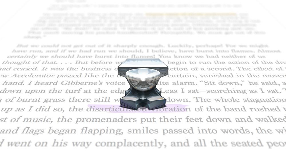
    When work began on this site the featured product was nearly complete, but the branding and marketing efforts occurred simultaneously. They cross-pollinated to such a degree that I even now I have resort to using “featured product” to avoid mentioning Wordsmith in the first sentence of the of Plow Software’s description. In another context I might think of that as a failure of design, but in this one I just think my, that anvil and that plow look nice together. Should I reject introspection or do I rest upon these lowly laurels?

    Development and Implementation

    The site was prototyped in HTML and then converted to a WordPress theme. I used bbPress to manage the associated support forums. The user guide was created using a custom post type and a couple of custom taxonomies.

    Unfortunately this site is no longer on the web.

  • Wordsmith

    Wordsmith

    Summary of My Role

    This is what you’d call a “personal project,” which is to say I did everything myself, from conceptualization to code-signing. Version 1.0 shipped on OS X Mountain Lion, was one of the first Mac Apps to support iCloud, and received a special promotional callout on the Mac App Store.

    Design and Creative

    • Anvil Icon and Wordsmith Branding
    • Lots of custom UI elements, visual and interaction design
    • Copywriting and illustrations for online user manual
    • Scripting and Production of Introduction videos

    Development and Implementation

    • Document-based OS X application with iCloud
    • GCD-based multithreading, extensive string manipulation and parsing
    • Many custom user interface components, precision typography, User Guide

    Six Elements of a Better Word Processor

    Here’s a quick run-down on what made the app itself. 

    LINGUISTIC ANALYZER

    This “analyzer” was really a collection of features that worked to identify and make accessible an index of proper names and places in your document. It was also the source of the data presented by the readability ribbon.

    I made the video below to promote the crazy thing.

    RELATIVE READABILITY

    A ribbon next to the text of the document that provided and x-ray view of the adjacent text. Darker areas indicate more complex or ambiguous prose. Again I made a promotional video:

    THE INSPECTOR

    wordsmith-inspector-annotation

    Presented here with a capitalized initial article, The Inspector sounds like a schlocky sleuth, but to the user it was the foundation of Wordsmith’s design approach. A contextually-aware inspector that was there when you needed it and disappeared when you didn’t. Annotate, Markup, Linking, Flagging and Highlighting all available with animated transitions.

    INSTANT REFERENCES

    Generate Academic-Style Citations easily as scanning a barcode. Wordsmith looked up the user’s reference on the internet and filled in all the boring fields automatically.

    Integrated Themes

    Wordsmith included a few simple controls to manifest a great variety of themes. Users who wanted to create an entirely custom theme could easily do so with a separate, free, theme designer application.

    wordsmith-theme-unawake.png

    Building the App

    Wordsmith was written in Objective-C in Xcode on OS X 10.8.

    As you might expect, Wordsmith made extensive use of Cocoa Text, the text layout engine used to render text on OS X. This system is famously easy to configure for most common uses, but becomes more difficult to work with in combination with modern platform API like Animation, HiDPI, and Concurrency. Locating and drawing controls around arbitrary text in a performant way was challenging.

    Beyond the App

    Website, User Guide, and Support Forum: Wordsmith’s promotional website was responsive way back in 2012. It ran WordPress and used bbPress to manage the associated support forums. The user guide was created using a custom post type and a couple of custom taxonomies.

    1449801560321

    This site has its own page on my portfolio.

    Promotional Videos: The videos (Above: Linguistic AnalyzerRelative Readability) were created entirely by me except for the music because I could not carry a tune in a bucket. The animation was made in Apple Keynote using a few slides to control overall pacing with timed transitions applied to the elements of each scene. Keynote exports to 1080p, then I moved it into iMovie to splice in the screen recording and record the narration.

  • Responsive Print Design Portfolio

    Responsive Print Design Portfolio

    It’s hard to ignore the fact that particular document designer is my wife, but that makes a kind of an embarrassing portfolio item title, even though she is the best client ever. Still, facts are facts, so there it is.

    Design

    Janine needed a simple personal site with a few pieces of her work. The site is spare on purpose, “spare,” that is, except for colorful and ornate banners that call out key projects and give the user a color-coded affordance to hang on to while browsing.

    Sometimes it the details you do at the last moment that are most rewarding. As it happens, that detail on this site is this animation of the tagline that’s fun and reinforces the theme of the site. It’s a nice moment for the first-visitor when the sentence becomes readable.

    Responsive Book and Magazine Case Studies

    janine-eckhart-stm-980x2249.jpg

    Development and Implementation

    The site was built using a node.js-based static site generator, assemble . I have been using the Grunt-based 4.x branch, but the new 5.x branch is close to release uses Gulp. Handlebars templates and Bourbon & Neat round out the front-end kit. Content is stored in markdown files.

  • CSS3Machine

    CSS3Machine

    CSS3Machine supported many then-experimental properties and featured a touch-friendly way to create and fine-tune webkit keyframe animations.


     css3machine-hero-iPad-icon

    Summary of My Role

    Development Highlights

    • Core Data iOS Application
    • CSS Generation
    • Bonjour Networking
    • Marketing Website
    • Custom Document Picker, Color Picker, Keyboards

    Design and Creative Tasks, A.K.A. “The Soft Arts.”

    • App Icon and CSS3Machine Branding
    • Custom Controls Document Picker and Browser, Color Picker, Custom Numeric keyboard, Preview Area Controls
    • Scripting and Prodution of Introduction videos

    Introduction

    What is CSS3? It’s the third version of the format for the code that gives websites their color, fonts, and layout. CSS is not a technology, just a specification published by the CSS Working Group. The developers of each browser must write the code to implement those specifications.

    CSS3 describes ways to create photoshop-like effects such as drop shadows and gradients and even animation on HTML websites. But the syntax for these was difficult and verbose, and slow-moving standards mean that many properties have to be redeclared multiple times with different vendor-specific prefixes. This means that typing advanced CSS is receptive and error-prone—the perfect application of a code generator.

    Use Case and Workflow Description

    [needs more about the workflow for creating on the app.] Discover and experiment with

    A user would use the app to create a style or effect, then connect her desktop browser to CSS3Machine by visiting a special URL to see the resulting code; easy to copy and use. This code updates automatically as the user adjusts her creation with CSS3Machine, which means getting the latest version of her generated code is only a Command-C away.

    Key Features of the App

    • Served a live-updating version of the resulting CSS on a website available to desktop computers on the same WiFi network as the iPad running CSS3Machine
    • Contextual Documentation
    • Dynamically Generated controls for the following CSS3 Features:
    • Text Shadow
    • Text Stroke
    • Box Shadow
    • Repeating Linear and Radial Gradients
    • Per-corner Rounded Corners
    • Box Reflect
    • 2D and 3D Transformations
    • Keyframe Animations With Per-Frame Preview

    Design and Custom User Interface

    CSS3Machine included many custom user interface components, and many customized Cocoa Touch components.

    Numerical Keypad

    Sliders are abundant in CSS3Machine (42 sliders, to be exact, heh), and they’re great when you’re roughing an effect out, but eventually you need more precise control.

    In iOS on iPhones or iPods Touch, there is a system-supplied number pad. The keys are arranged like a ten-key, and it makes for key efficient numeric entry. Sadly, attempting to call this keyboard style on the iPad results in the regular keyboard in “numbers mode,” with the full alphabet and numbers in a row across the top. Not exactly great for serious numeric entry.

    So I created a custom keypad, modeled after the one in Numbers.

    css3machine-keypad.png

    css3machine-press-macstories-css-entry.png

    css3machine-press-macstories-html-template.png

    It’s easy to get something like a custom keyboard wrong; browsing the app store will illustrate some ways not to do it. There are some nice implementations out there, too, but here’s a close up of my keys and Apple’s. The keys have the same depressed states, and make the same sound. Sadly, there’s no approved way to discover what the user’s “keyboard clicks” preference is set to, so I run the risk of annoying users who have keyboard clicks off. There’s an open bug [rdar://7664981], so maybe soon there’ll be a way to accommodate the user’s preferences with something besides the physical mute switch.

    The Preview Pane

    It became apparent in even the early builds of CSS3Machine that the preview pane needed to be dynamic. Sometimes, it was just in the way. Sometimes, it needed to be bigger.

    How to create the control for that in a way that didn’t clutter the interface with a lot of unnecessary chrome took a while to figure out. In the end I settled on a pane that slides in above the control surface with a couple of subtle, frameless buttons to control it.

    When creating WebKit animations, CSS3Machine shows you a preview of the keyframe you’re currently editing.

    When creating WebKit animations, CSS3Machine shows you a preview of the keyframe you’re currently editing

    The Color Picker

    Just like keyboards, there are a lot of crummy color pickers in iOS apps. Apple dodged the question altogether, providing a simple set of color swatches in the iWork iPad apps. Omni has two color pickers in OmniOutliner on the iPad, along with a bunch of swatches and a grayscale picker, which seems like overkill to me. Having to stop to think about specific RGBA values interrupts the creative process.

    I created a custom color picker for CSS3Machine that’s large and finger-friendly. Behind the scenes it writes CSS3-compatible rgba values to the stylesheets.

    Document Interface

    Contextual Documentation

    CSS3Machine included documentation for each of the CSS3 features for which it provided an interface. This included vendor prefix information and a chart of current browser support.

    Results and Press

    • Featured by Apple
    • Top 50 Productivity Apps

    CSS3Machine was immediately listed on iPad Apps That Don’t Suck (It’s always nice to know you don’t suck, even if the website which certifies it is no longer with us). The app climbed into the Top Productivity apps section in the App Store and was featured in New and Notable. Andy and Emily at Shaping the Page said it’s “like a CSS editor from the future.”

    figure>

    “Iʼm a web developer. I live and breathe HTML and CSS. I have never, ever, seen anything as cool or as useful as CSS3Machine. > Given that CSS3 is full of these obscure and verbose (especially the webkit specific stuff) keyframes and gradient background stuff that nobody ever has time to memorize, having a tool that does it all for you with a visual interface is a godsend.”

    — Federico Viticci

    Macstories Review

    Above is an excerpt from a review on MacStories, which you can read it in its entirety there.

  • PDX Breakfast

    PDX Breakfast

    I made a Paul Gerald’s Portland breakfast restaurant guidebook into an iPhone app.

    I conceived of a few use cases for the app. For each of these cases, the app provides a tab. Browse, Collections, Nearby.

    Browsing: The user wants to see the curated list of restaurants.
    I’m in the Mood for __________: This user wants to find places with a specific attribute. In the paper version, restaurants were “”
    Feed Me: This user is interested getting something soon and close.

    Rounding out the Tab-bar quartet is the book tab, which shows an upsell with a simple call to purchase a paper copy of the book.

    IS THAT LOBSTER?

    Indeed. Impallari Type’s Lobster had just been released. Moreover, iOS Apps had just been granted the ability to package and include custom fonts. Lobster’s permissive license, narrow width, and extensive OpenType ligatures made it the perfect choice for the heaviest lifting in the app: to display the names of restaurants.

    To represent the app in the App Store and on user’s home screens I created an icon in a few hand-adjusted sizes.

    Development

    The app is a native iOS application, using Core Data, MapKit and Core Location, WebKit, and lightly modified UIKit controls